


What if the best way to make your 10×10 booth more noticeable is to take something away? When space is tight and larger displays compete for attention, it’s tempting to add more graphics, products, and signs. But learning how to make a 10×10 booth stand out starts with a clearer choice: give every element a purpose, and let your strongest message lead.
A compact booth can still feel polished, welcoming, and easy to understand at a glance. Create a clear visual hierarchy, leave room for browsing and short conversations, and choose display pieces that work together rather than compete. This guide will help you decide what deserves space, plan a layout that invites visitors in, and build a memorable presence without crowding the footprint. Coordinated, reusable display elements can also support your brand at future events, making the booth useful beyond a single show.
Key Takeaways
- Learn how to make a 10×10 booth stand out with a clear, fast-reading idea visitors can grasp at a glance.
- Use one focal point, supporting messages, and intentional contrast to help visitors know where to look.
- Choose additional displays only when they serve a specific brand or visitor goal.
- Plan the open entrance, product placement, staff positions, and conversation space to support easy movement.
- Shape a cohesive booth brief so backwalls, flags, tablecloths, and signs work together as one visual system.
Why a 10×10 Booth Needs a Clear, Fast-Reading Idea
A standout booth doesn’t have to dominate the exhibition floor. It needs to catch a visitor’s eye, communicate what the brand offers, and make approaching feel natural. In a compact footprint, every graphic and object competes for attention. If several messages demand equal focus, people may pass before they understand any of them.
Think of the visitor journey as three quick decisions: spot the brand, understand the offer, then decide whether to engage. A clear idea helps visitors make each decision. Visual hierarchy is the order in which a booth guides the eye from its most important message to supporting details. This principle connects to visual merchandising, where presentation helps attract attention and make an offer easier to understand. When planning how to make a 10×10 booth stand out, the goal isn’t to say everything at once. It’s to make the right message unmistakable.
What should visitors understand in the first few seconds?
Answer three questions in order: Who is this for? What does the brand offer? Why might it be useful to stop? For example, a company exhibiting a product could lead with its product category, then add a brief benefit or invitation to see a demonstration. Keep the main message short enough to scan while walking. Save specifications, a full product range, and detailed explanations for conversations, where staff can tailor information to visitors’ interests.
Why can a smaller booth still feel distinctive?
A focused visual anchor, such as a bold headline on a backwall display, can be easier to remember than several unrelated graphics. Build around it with a consistent color palette, imagery, and typography so each element reinforces the same brand impression. Visible branding helps attendees identify the booth from a distance; supporting details can reward visitors who come closer.
Distinctiveness comes from deliberate choices, not sheer quantity. Before adding an element, ask whether it strengthens recognition, clarifies the offer, or gives visitors a useful reason to engage. If it doesn’t, it may distract from the booth’s central idea. A compact space can feel confident and complete when its key message is easy to find, its supporting visuals belong together, and there’s room for conversation.
Build Booth Impact with Visual Hierarchy, Height, and Contrast
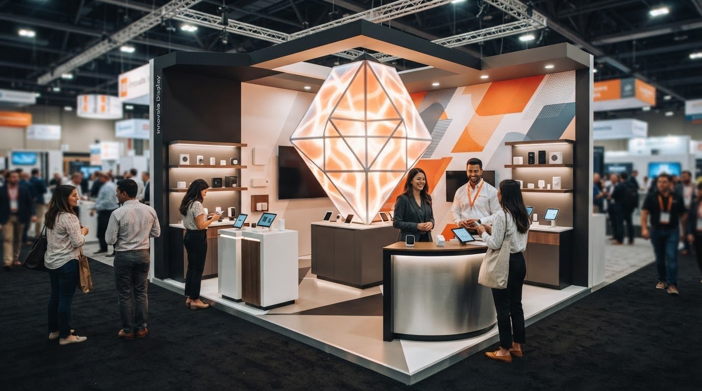
Once the central idea is clear, give it a visual order visitors can read at a glance. Start with one focal point, such as a bold brand identifier or concise headline. Add a supporting message that clarifies the offer, then reserve smaller details for visitors who pause. One clear message is more memorable than several competing headlines because it gives the eye a place to land.
Height helps the message rise above tabletop activity, while contrast makes it easier to spot and read. Negative space matters too: an uncluttered area around a headline or image gives it room to register. Freeman’s guide to exhibit design best practices also emphasizes clear messaging and consistent branding, useful foundations for planning graphics that work together.
How should you use vertical space in a 10×10 booth?
Place the main brand identifier high enough to remain visible when products, staff, and visitors gather around a table. Let a backwall display carry the primary message and strongest visual anchor, creating a clear point of recognition from the aisle. Custom flags or other vertical signage can extend brand visibility, but treat them as supporting cues: reinforce the brand or point toward the booth without introducing another headline that competes with the backwall.
Which graphics and colors attract attention without overwhelming visitors?
Choose strong contrast between text and its background so the message stays legible in a busy hall. Pair it with one dominant image that directly supports the product or service story. An image that illustrates the offer adds meaning; a decorative image that tells a different story adds noise.
Carry the same typography, colors, and visual style across the backwall, signs, and tablecloth. Repetition makes separate pieces feel like one considered display rather than a collection of unrelated graphics. That cohesion can make a compact booth feel more confident without adding more elements.
Before finalizing artwork, review it from a typical aisle viewing distance. Step back from a screen or printed proof and check whether the brand and main message are easy to pick out. If small text disappears or the headline blends into the background, simplify the wording, increase contrast, or give the message more space. This practical review is central to how to make a 10×10 booth stand out without relying on visual clutter. For help bringing booth graphics and display elements into one visual system, explore cohesive event display design.
Does a 10×10 Booth Need More Displays to Stand Out?
No. Extra displays help only when each one supports a clear brand or visitor goal. A focused setup makes the offer easier to spot, keeps messages readable, and gives people room to step in. By contrast, a booth crowded with repeated signs, products, and furniture can make it harder to see what matters or where to pause. The goal isn’t to fill every inch. It’s to use the space with intention.
Every display also takes up room that could serve another purpose. More product visibility may mean less space for comfortable conversation; extra furnishings may limit browsing or leave nowhere practical for supplies. Consider how visual hierarchy guides attention, then judge each element by the role it plays in the visitor’s experience.
How do you decide what deserves space?
Give each item one primary job: attract attention, explain the offer, demonstrate a product, or support a conversation. A backwall display might introduce the brand, while a product sample helps explain how it works. If two signs repeat the same message without offering a different benefit, keep the stronger one. Then protect enough open area for visitors to browse, pause, and talk with staff without blocking the display.
A quick floor-plan test can reveal crowding before setup: mark the footprint, place each planned display, and sketch where people will stand. If the layout leaves no comfortable spot for a short conversation or forces visitors around furniture to see a product, reduce or reposition the elements. This kind of practical editing is central to how to make a 10×10 booth stand out.
When do modular or reusable elements make sense?
Reusable components can be useful when your event schedule or messaging changes. Consider whether a display can work in different booth arrangements and whether its graphics can be updated while the overall look stays recognizable. Prioritize pieces that earn their place across multiple events, not items that solve only a one-time styling problem. Reuse and material decisions call for planning around durability, storage, and future needs.
For a closer look at display formats and planning considerations, explore the guide to custom trade show displays. The strongest compact setup isn’t necessarily the one with the most pieces. It’s the one where each display has a purpose, products remain visible, conversations feel comfortable, and there’s room to move.
Plan a 10×10 Booth Layout That Welcomes Visitors
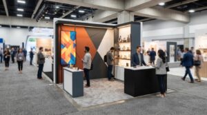
A strong booth layout balances two jobs: making the display easy to notice and making the space comfortable to enter. Start by identifying the open side of the footprint and the direction visitors will approach from. Place the focal point where it’s visible on arrival, then protect a clear route into and through the booth.
Sketch the footprint before deciding where each item belongs. Mark the backwall, product displays, table, staff positions, and any spot where visitors might stop for a conversation. This simple plan can reveal bottlenecks before graphics or physical display elements are produced. It also helps you check whether a feature that looks impressive on its own blocks the message or movement around it.
Where should the focal point and key message go?
Place the primary brand or offer message where approaching visitors can see it without searching. A backwall can serve as the visual anchor, while a featured product or demonstration sits within easy reach, not directly in the entrance path. Supporting signs can point toward the next useful interaction, such as a product to explore or a team member ready to explain it. Each element should guide attention without pulling visitors in conflicting directions.
How can the booth stay open and easy to navigate?
Keep the natural entry clear. A table or banner stand placed across the front may create a barrier, even if it offers convenient product space. Position staff where they can greet people without forming a human wall, and leave room for someone to pause while another visitor browses. A small conversation area can sit toward the side or back, keeping the welcome and the discussion from competing for the same space.
Review the plan from two viewpoints: the aisle, to check what catches the eye and whether the entrance looks inviting; and inside the booth, to see whether visitors can browse, turn, and speak comfortably. Try the layout with the team’s likely positions marked, not just the display pieces. That makes it easier to spot blocked sightlines or awkward traffic patterns.
Before the event, check that visitors can see the message, enter without obstruction, reach the featured product, and find a comfortable place to talk. If one of those steps feels difficult on the sketch, adjust the placement before production. A deliberate layout is a practical part of how to make a 10×10 booth stand out: it turns visibility into a welcoming experience.
Ready to shape a visitor-friendly booth concept? Explore event display design for ideas on coordinating branded elements with your layout.
Turn a Standout 10×10 Booth Concept into a Cohesive Display
A strong booth concept is easier to produce when its goals are written down first. A concise design brief gives the creative and fabrication process a shared foundation, helping each graphic, product display, and physical element serve the event rather than compete for space.
What should go into a 10×10 booth design brief?
Start with the audience, the event’s purpose, and one visitor action you want to encourage, such as trying a demonstration or speaking with a team member. Then capture the practical details that shape the booth: which products must be shown, what graphics are essential, whether supplies need to be stored, and what kind of conversations the layout should support.
Include your brand assets and event requirements, along with the planned footprint and open side. This gives design decisions a clear context. For example, a booth built to introduce one featured product may need a different balance of demonstration space and messaging than one focused on several products. A useful brief keeps both visual ambition and the on-site experience in view.
How can display elements work together across the booth?
Give each piece a distinct role within one visual system. A backwall can establish the main brand message; a flag can help identify the booth from the aisle; a tablecloth can carry through brand colors; and supporting signs can direct attention to a product or conversation. Keep typography, colors, and imagery aligned, but don’t force every element to repeat every detail. Repetition should build recognition, not create a wall of competing messages.
Review the combination as a visitor would encounter it: first from the aisle, then while entering, and finally while browsing or talking with staff. Check that the central message remains easy to find and that supporting pieces guide attention rather than distract from it. This final review connects the brief to the finished display and helps keep the footprint cohesive.
That discipline is at the heart of how to make a 10×10 booth stand out: match a clear message with purposeful displays and a comfortable layout. Zodiac Event Displays brings design and fabrication together to turn booth goals into coordinated physical elements, drawing on over ten years of event-display experience. For more on the path from concept through production and delivery, explore the event display design and fabrication process.
Have a booth concept in mind? Discuss your 10×10 booth project with Zodiac Event Displays.
Make Every Inch Work for Your Brand
A memorable 10×10 booth doesn’t need more elements; it needs the right ones working together. Lead with one clear message, use a strong visual focal point, and arrange displays so visitors can see the offer, move comfortably, and start a conversation. A thoughtful layout and concise design brief help turn limited space into a cohesive brand experience.
That’s the heart of how to make a 10×10 booth stand out: make every visual and interaction earn its place. Zodiac Event Displays brings over ten years of event-display experience, with design and fabrication for coordinated backwalls, flags, signs, tablecloths, and more, along with global delivery.
Ready to turn your booth goals into a focused display concept? Discuss your 10×10 booth project with Zodiac Event Displays and take the next step toward an inviting, unmistakably yours presence on the show floor.
Frequently Asked Questions
How do I make a 10×10 booth stand out?
To make a 10×10 booth stand out, lead with one clear message and a focal point visitors can see from the aisle. Use strong contrast between text and background, then keep the approach open so people can step in comfortably. Give every display a job: build brand recognition, explain the offer, or support a conversation. Review the complete setup from the aisle and remove pieces that compete rather than strengthen the brand.
What should I put in a 10×10 trade show booth?
Include a clear brand identifier, one primary message, a relevant product or demonstration, and supporting graphics. The right mix depends on your event goal and audience. For example, a booth inviting visitors to try a product needs an accessible demonstration area, while one focused on brand awareness may prioritize prominent branding. Leave space for visitors and staff to move and talk. Filling every corner with furniture, signs, and repeated information can make the booth harder to browse.
Can a small 10×10 booth attract visitors at a trade show?
Yes. A compact booth can attract attention when its message is easy to read, its branding feels consistent, and its focal point is visible from the aisle. Size alone doesn’t determine impact. A purposeful layout helps visitors understand where to look and how to enter, while a welcoming approach makes it easier to start a conversation. Focus on communicating one useful reason to stop rather than competing through the number of display pieces.
How do you arrange a 10×10 booth layout?
Start by identifying the open side and the direction visitors will approach from. Place the main message where people can see it on arrival, then position products or demonstrations where they’re accessible without blocking entry. Preserve a comfortable spot for brief conversations. Sketch the footprint before settling on display placements, including where staff will stand. Finally, review the setup from the aisle and from inside the booth to catch blocked views or awkward routes.
How many banners should a 10×10 booth have?
There’s no universal number; the right choice depends on your goal, sightlines, and what the rest of the booth already communicates. Assign each banner a distinct role, such as making the brand easier to spot or directing visitors toward a demonstration. Consider how it works with the backwall, product displays, and other signage. If two banners repeat the same message without adding a new benefit, removing one may make the remaining message clearer.
What is the best way to make a small booth look professional?
Create a coordinated look with consistent colors, legible typography, polished graphics, and display elements that feel like part of the same system. Leave uncluttered space around key messages so visitors can focus on them. Review graphics at a typical event viewing distance, not just close up on a screen. Then check that the message, imagery, and physical layout all support the same brand impression. A deliberate, consistent presentation often feels more professional than a crowded one.
How can I make my 10×10 booth feel more open?
Keep the entrance clear, limit oversized furniture, and arrange products or signs around a visible focal point rather than across the visitor’s path. People are more likely to approach when they can tell where to enter and what to look at. Sketch the layout and mark where staff and visitors will stand. If a table, sign, or product display interrupts movement or makes conversation awkward, adjust its position or remove it.
 Previous reading