



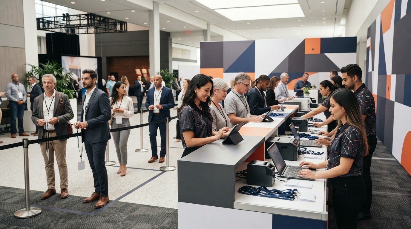
A beautiful registration counter that slows the line is a design failure. Effective event registration counter design starts with the check-in workflow: where guests approach, how staff handle devices and materials, and how to keep the queue moving without crowding the entrance.
It’s understandable to focus first on appearance. The registration area is often a guest’s first close-up view of your event brand, and cluttered graphics or hard-to-read messaging can undermine an otherwise polished setup. The strongest design balances both priorities, giving staff a practical workspace while making the welcome clear and memorable.
This guide will help you plan a counter layout around visitor flow, check-in tasks, and your event footprint, then shape a visual identity that feels cohesive rather than crowded. You’ll also find key considerations for accessibility, technology, and surrounding branded elements, plus a brief to help compare design and fabrication options. The goal is a registration area that works smoothly at the front of the event and sets the right tone from the first interaction.
Key Takeaways
- Plan event registration counter design around the attendee journey, from arrival and check-in to clear directions into the event.
- Keep the welcome area visually focused: prioritize the event name, a concise greeting, and essential instructions.
- Compare a counter, branded table, or portable display-led setup against your event’s transport, storage, staffing, and setup needs.
- Build a production-ready brief with venue details, workflow, brand files, dates, and transport requirements before evaluating options.
- Use cohesive surrounding assets, such as table cloths and trade show displays, to create a more unified registration zone.
Start Your Event Registration Counter Design with the Check-In Experience
A registration point has three jobs: orient arrivals, confirm they’re expected, and show them where to go next. A registration counter is the branded, functional check-in point where guests approach staff or a check-in system, get help, and move into the event. Treating it as part of the wider practice of event management helps connect its layout to the venue plan, staffing, and attendee experience.
Before choosing a shape or visual treatment, trace the guest journey from entrance to event floor. Consider where someone first sees registration, where they pause to scan or speak with staff, how they can ask questions without blocking others, and which route they take after check-in. A clear sequence reduces guesswork for guests and gives the team a practical basis for event registration counter design.
What should an event registration counter help attendees do?
Guests should be able to spot the check-in point, understand where to join the queue, complete the required steps, and continue onward. Map likely needs for your event type: a conference may involve badge pickup and questions, while a smaller gathering may need a simpler welcome and confirmation process. Match the plan to arrival patterns, staffing, and check-in tools.
Keep instructions focused. Make the event name and essential directions easy to notice, then give staff room to handle exceptions or longer questions without holding up routine check-ins. Avoid placing competing messages where guests need to decide what to do next.
How do you plan the counter footprint and visitor flow?
Sketch the setup before selecting a counter or table arrangement. Mark the entrance, queue, staff work area, nearby displays, and onward routes. Draw anticipated queues separately from circulation paths so waiting guests don’t obstruct people passing through or trying to reach another area. Include space for staff to access devices and supplies without crossing through the line.
Then compare the sketch with the actual venue plan. Check sightlines from the approach, nearby doors, and likely arrival directions. A layout that works in an open hall may not suit a narrow foyer. Don’t assume one set of dimensions fits every venue. Confirm access and safety requirements with venue staff or qualified event professionals, and revise the plan before finalizing the setup.
Use a simple walkthrough to test the flow: imagine arriving, locating the right line, completing check-in, asking a question, and moving into the event. If any step feels unclear or forces guests to double back, adjust the route or clarify the signposting. This early test turns a floor-plan sketch into a useful working brief for the next design decisions.
Build a Registration Counter Design Around Brand Clarity and Useful Details
Once the check-in flow is clear, shape the visuals around one goal: help guests recognize the right place and know what to do. Strong event registration counter design gives the event or organization name the lead, adds a concise welcome, and includes only directions that support the next step. A useful rule is simple: one dominant message should lead; supporting details should stay secondary.
Which branding elements belong on the counter?
Start with approved brand assets, including current logos, colors, typography, and event-specific messaging. Choose the logo placement and scale deliberately so it identifies the host without competing with the welcome or check-in instruction. For example, a concise “Welcome” paired with a clear “Check in here” may be more useful than several slogans, sponsor marks, and directions packed together.
Include procedural or directional text only if it helps guests complete the next step, such as indicating where to join a line or where to go after confirmation. Keep the public-facing design separate from personal data, staff notes, and operational materials. Those belong in the check-in workflow, not on graphics guests see.
How can you keep event graphics legible and production-ready?
Build hierarchy with scale, contrast, and breathing room. A prominent event name, a clearly separated instruction, and restrained supporting details are easier to scan than multiple elements competing for attention. Consider where guests will approach from and how far away they need to recognize the check-in point. Review the artwork at a realistic viewing scale rather than judging readability only on a zoomed-in screen.
Before artwork is finalized, ask the production partner to confirm its specifications. Requirements can vary by material and format, so verify accepted file types, bleed, safe areas, color handling, and artwork deadlines instead of assuming universal standards. Request a proof and check that important text and logos remain clear in the intended layout. Don’t promise exact viewing distances or color matching unless the fabricator has confirmed them.
For event identity and messaging, Duke University’s overview of conference attendee registration services offers context on the registration experience beyond the physical point of check-in. A branding partner can also help coordinate approved graphics across the registration area and nearby event assets. Explore branded event display options as you develop the visual brief, and confirm whether your specific counter requirements fit the provider’s scope.
Compare Registration Counter Approaches Before Choosing a Design
The right setup depends on how registration works, not just how it looks. A dedicated counter may suit repeated check-in use if its format, transport needs, and project scope are confirmed with a supplier. A table with a branded table cloth can be a straightforward option for a simpler setup, while a portable display-led arrangement may frame the welcome point when space, transport, or storage shape the plan.
Each approach has trade-offs. A dedicated counter may create a defined, prominent check-in point, but you’ll need to verify its footprint, assembly, and storage requirements. A table setup can be adaptable, though you should check that the table, cloth, and staff workspace suit the workflow. Displays can add visual presence around registration, but they shouldn’t obstruct queues or routes. For event registration counter design, compare complete requirements rather than choosing on appearance alone.
Compare requirements with details to confirm
| Approach | Requirements to document | Features to confirm before ordering |
|---|---|---|
| Dedicated counter | How often it will be used, staff tasks, transport, and storage | Available format, footprint, assembly process, materials, and project scope |
| Branded table setup | Existing table availability, check-in equipment, staff workspace, and event frequency | Table dimensions, cloth fit, fabric or graphic options, and setup requirements |
| Portable display-led arrangement | Venue space, transport capacity, assembly responsibility, and desired visual presence | Display formats, stability, setup process, and compatibility with the planned layout |
Let portability and event context guide the choice
Think through the full event cycle: who transports and assembles the setup, where it will be stored, and how often it will travel. Consider whether it’s intended for an indoor venue or an outdoor event, and check venue rules and operating conditions with the relevant supplier or venue team. A format that works for a single event may not be the most practical choice for a recurring program.
Compare staffing and setup alongside visual impact. For example, if the check-in team needs room for devices and supplies, confirm that the proposed arrangement supports those tasks without crowding the queue. If a table cloth or nearby display will carry the branding, verify that those elements work together in the actual space. Ask prospective suppliers to confirm availability and specifications directly. Don’t assume every provider offers every format. Confirm the details before committing, then choose the setup that best balances workflow, reuse, and a confident welcome.
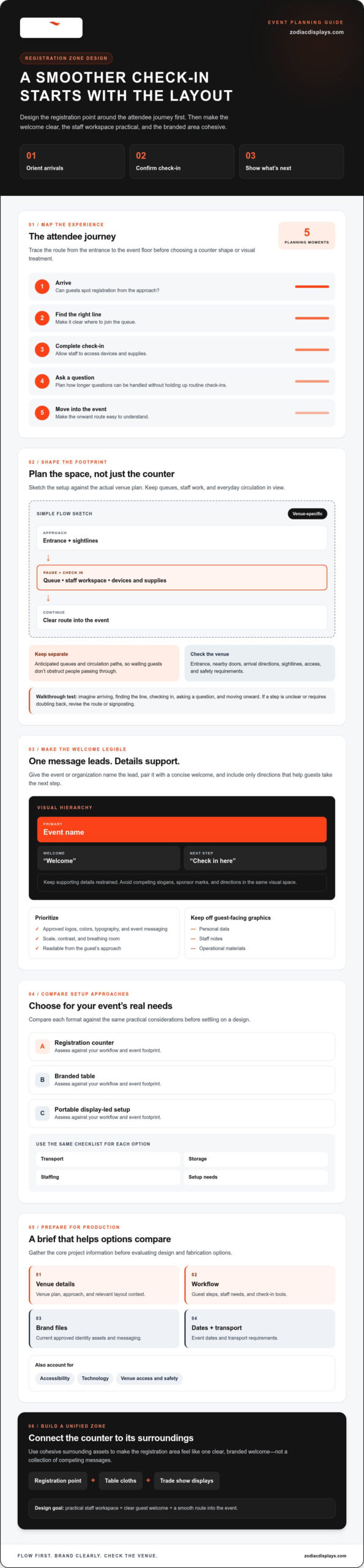
Turn Your Event Registration Counter Design into a Production-Ready Brief
A clear brief helps prospective suppliers assess the project and identify what they can deliver. For event registration counter design, distinguish the counter itself from related branded assets, and ask directly whether counter design or fabrication is within each supplier’s confirmed scope. Be specific about your goals, venue, workflow, and deadlines so estimates and proposals can be compared on the same basis.
What should you include in a supplier brief?
Describe who the event is for, what attendees need to do at registration, and what the venue allows. Note whether the setup is for one event or intended for reuse, who will assemble it, and how it will be transported. Include approved brand files, message priorities, event dates, artwork deadlines, and the name of the person responsible for approving creative proofs.
Gather the essentials before requesting options:
- Event dates and the venue plan, including relevant entrances and registration space
- Check-in workflow, staffing needs, and equipment or materials used at the station
- Transport, storage, reuse, and setup requirements
- Current logos, brand colors, fonts, and approved event wording
- A project contact and the artwork approver
Ask suppliers to confirm their scope, proposed materials and graphics, assembly requirements, delivery arrangements, and any exclusions. This makes it easier to identify assumptions before they become project issues.
What should you check before approving production?
Review the proof at its intended viewing scale. Check spelling, event details, logo placement, contrast, alignment, and whether the main message is still clear. Confirm production specifications with the supplier, including artwork requirements, materials, delivery arrangements, setup responsibilities, and the deadline for approval. If a detail affects the venue plan or attendee access, verify it with the venue team before sign-off.
Move through the brief in sequence:
- 1. Define goals: Describe what guests should notice and do at registration.
- 2. Document the venue: Share the plan, constraints, and relevant routes.
- 3. Select an approach: Identify the setup format you’re considering and what must be confirmed.
- 4. Prepare artwork: Supply approved assets and clarify the message hierarchy.
- 5. Approve proofs: Check content and production details before authorizing the next step.
If the registration area is part of a larger exhibit, explore branded event display options and explain the full brief so the provider can confirm whether the requested work fits its scope. For wider exhibit planning, consult a guide to custom trade show displays; for related branded assets, review event display fabrication guidance.
Create a Cohesive Registration Zone with the Right Event Branding Partner
A well-planned registration area should feel like the natural beginning of the event, not a separate display competing for attention. Consistent colors, typography, and logo use across the welcome point and nearby graphics help guests recognize where to go. Give each element a clear role: the registration point welcomes, a sign directs, and a backwall or banner builds the visual setting without repeating the same message everywhere.
How can surrounding event displays support registration?
Choose supporting assets to suit the venue and event plan. A branded table cloth can identify a check-in table, while a backwall display or banner can add visibility behind or beside the registration area. Keep sightlines and circulation in mind, and use directional messages only where they help guests decide what to do next. For broader possibilities, explore custom event displays such as table cloths, backwall displays, and banner stands.
Build one visual system rather than treating each surface as a separate design. Share the same approved brand assets and color approach, then adapt the layout to each format. Zodiac Event Displays has over ten years of experience in event marketing materials and soft signage, with design, fabrication, and global delivery capabilities. These offerings can support a cohesive branded environment, but a dedicated registration counter isn’t confirmed, so ask about counter-specific requirements directly.
How should you evaluate a potential design and fabrication partner?
Look for a process that makes responsibilities clear from the start. Ask how creative input, artwork review, fabrication, and delivery coordination are handled, and request relevant work examples to assess fit. Confirm which assets are included, what information the supplier needs from you, and what falls outside the proposed scope. For any counter itself, verify whether the supplier can provide the requested design or fabrication before treating it as part of the project.
A useful partner should also understand how the assets work together in the actual registration zone. Share the venue plan, intended attendee flow, and the role of each graphic so the team can consider the complete setup, not just individual pieces. Clear expectations help protect both the practical check-in experience and the visual impact of your event registration counter design.
When discussing a coordinated registration area, describe the event branding project and confirm which elements fit the brief, including any counter-specific needs.
Make Your Registration Area Ready to Welcome
A successful event registration counter design starts with the guest journey, then brings together clear messaging, practical flow, and a cohesive visual identity. Choose a setup based on venue, staffing, transport, and reuse needs, and turn those decisions into a brief that makes supplier scope and production details clear.
For a polished registration zone, coordinate nearby branded assets such as table cloths and trade show displays without letting graphics compete with essential directions. Zodiac Event Displays brings over ten years of experience in event marketing materials, with design, fabrication, and global delivery among its capabilities. A dedicated registration counter isn’t a confirmed offering, so describe your requirements and confirm what fits the project.
Discuss your event branding brief and explore how the right supporting displays can help create a confident first impression. With a thoughtful plan and clear partner expectations, you’re ready to welcome guests with purpose and polish.
Frequently Asked Questions
What makes an effective event registration counter design?
An effective event registration counter design makes check-in easy to find, supports staff tasks, and shows guests what to do next. Start with the venue plan and map the steps attendees need to complete, such as joining a queue, confirming registration, or asking for help. Then give the event identity and essential directions visual priority. Keep graphics uncluttered, and confirm layout, access, and production requirements with the venue and supplier.
How do I choose the right size for an event registration counter?
There’s no universal size that suits every event. Base your decision on available floor space, expected queues, staff roles, check-in equipment, circulation, and venue requirements. Use the actual venue plan to assess the footprint and routes, then confirm measurements with venue staff or the supplier. If you’re considering a counter product, verify its specific dimensions and specifications directly instead of relying on general assumptions or a layout from another event.
What should I put on a registration counter?
Feature the event or organization name, a short welcome, and only the directions attendees need to check in or find assistance. For example, a simple check-in instruction may be more useful than several competing slogans. Keep personal data and staff notes off public-facing graphics. Before approving artwork, review it at a realistic viewing scale and check that the text is readable, contrast is clear, and the visual hierarchy leads guests to the next step.
Should I use a custom counter or a branded table?
Choose based on workflow, venue, transport, storage, setup, and whether you’ll reuse the arrangement. A branded table setup may fit a simpler check-in point, while a dedicated counter may be worth exploring for repeated use. Compare the actual specifications and practical requirements for each option. Ask suppliers directly whether counter design or fabrication is within their confirmed scope, and don’t assume a provider offers a counter just because it supplies related event displays.
How can I make a registration counter easier to see?
Make the registration point visually distinct and place it where arriving guests can recognize it. Use readable lettering, strong contrast, concise directions, and consistent event branding. Check sightlines from likely approaches using the venue layout, and avoid surrounding the counter with signs that compete for attention. Before finalizing placement, ask the event team or venue to review circulation and applicable accessibility needs so the welcome is visible without obstructing movement.
When should I finalize event registration counter graphics?
Set the artwork schedule early enough to accommodate design, supplier specifications, proof review, possible revisions, and delivery coordination. The right lead time depends on the project and supplier, so ask for confirmed dates rather than assuming a standard timeline. Share approved brand files and accurate event details promptly. Before production begins, get clear confirmation of artwork deadlines, who approves the proof, and when that approval is needed.
Does Zodiac Event Displays sell event registration counters?
The available company information confirms branded event displays and related assets, including table cloths and trade show displays, but doesn’t confirm a dedicated registration counter product. Zodiac Event Displays provides design, fabrication, and global delivery for its stated offerings. If a counter is part of your planned setup, describe the project and ask the company directly whether that specific element fits its scope. You can also ask about supporting branded assets for the registration area.

 Previous reading