


What if a sponsorship banner could make every partner visible without letting logos take over the event? The strongest sponsorship banner design ideas treat sponsor recognition as part of the visual hierarchy, not an extra layer squeezed around the event name. That matters when logos compete for attention, the layout feels crowded, or a screen-ready design loses clarity at full print size.
It’s natural to want every sponsor represented prominently, but clear recognition doesn’t require giving every element equal weight. A focused layout leads with the event identity, groups partner logos intentionally, and leaves enough breathing room for the message to register in person and in photos.
In this guide, you’ll find 12 practical concepts for different event settings and a straightforward way to choose among them. We’ll cover logo placement, scale, contrast, and viewing distance so your banner feels polished on screen and at event size. The result is a coordinated design that supports the event brand while giving sponsors a clear place to shine.
Key Takeaways
- Explore sponsorship banner design ideas for different settings, from headline-led event banners to tiered sponsor panels and repeating logo strips.
- Match the layout to the event environment and sponsor mix, whether you’re planning a trade show, festival, community gathering, charity event, or recurring activation.
- Use a design-to-preflight workflow to review the brief, organize content, refine the layout, and prepare production files.
- Carry a consistent visual identity across banners, flags, tents, signs, and backwalls to make sponsor recognition feel intentional throughout the event.
- Bring event goals and sponsor needs together through a collaborative process that turns a single banner concept into a cohesive display plan.
Sponsorship banner design ideas start with one clear visual hierarchy
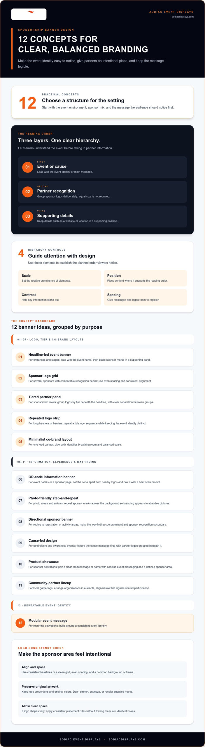
A sponsor banner has to balance three things: event identity, partner recognition, and legibility. Give every element equal visual weight and the design can feel crowded. Instead, plan a reading order: the event or cause first, the sponsor group second, and supporting details third. This lets the banner work as both event branding and sponsor recognition.
Sponsorship banner hierarchy is the planned order in which viewers notice the event, its partners, and its supporting details. That order is an example of visual hierarchy, the design principle that uses scale, position, contrast, and spacing to guide attention. A sponsor can have a prominent place without every logo being the same size. Placement can reflect agreed partnership tiers, while consistent treatment within each group keeps the full composition balanced.
What should a sponsorship banner communicate first?
Start by identifying the event name, its audience, and the main action the banner should encourage. Is it welcoming people to a community festival, directing attendees toward a charity event, or building awareness for a conference? Those goals help determine which message deserves the strongest position and scale.
Keep the event message distinct from sponsor recognition. For example, a festival banner might lead with the festival name, show partner logos together beneath it, and place a website or location in a smaller supporting position. One focal point helps passersby understand what the event is before they take in the partner information.
How do you make several sponsor logos feel cohesive?
Give logos a shared structure. Align them along consistent baselines or within a clean grid, use even spacing, and place them on a common background or within a frame. These choices create order without altering the artwork sponsors supplied. The logo area should feel like a deliberate part of the banner, not a collection of marks added wherever space remains.
Preserve each logo’s proportions and original colors. Don’t stretch, squeeze, or recolor marks to make them fit. If logos vary in shape, apply consistent placement rules and give each enough clear space rather than forcing them into identical boxes. A tiered panel can distinguish partner levels through position or grouping, while keeping logos within each tier aligned and easy to scan.
The strongest sponsorship banner design ideas begin with a shared plan for what the event needs to say and how partners should appear. That framework makes sponsor visibility feel intentional while protecting the event’s identity and keeping the message readable.
12 Sponsorship banner design ideas for bold, balanced event branding
The right concept depends on the setting, sponsor mix, and message the audience needs to notice first. Use these sponsorship banner design ideas as starting points, then choose the structure that best fits your event and partner relationships.
Logo grids, tiers, and co-branded layouts
Choose a layout that reflects how sponsors are participating. A grid works when partners need comparable recognition; a tiered panel makes different partnership levels clear. With one lead partner, a co-branded composition can balance both identities without competing with the event headline.
- Headline-led event banner: For entrances and stages. Lead with the event name, then place sponsor marks in a supporting band.
- Sponsor-logo grid: For several sponsors with comparable recognition needs. Use even spacing and consistent alignment.
- Tiered partner panel: For events with sponsorship levels. Group logos by tier beneath the headline, with clear separation between groups.
- Repeated logo strip: For long banners or barriers. Repeat a tidy sequence of logos while keeping the event identity distinct.
- Minimalist co-brand layout: For an event with one lead partner. Give both identities deliberate breathing room and balanced scale.
Interactive, directional, and photo-ready concepts
Some banners need to do more than identify an event. They can help guests find a destination, connect with useful information, or carry event branding into attendee photos. Keep each design focused on one purpose so sponsor recognition supports, rather than obscures, the message.
- QR-code information banner: For event details or a sponsor page. Set the code apart from nearby logos and pair it with a brief scan prompt.
- Photo-friendly step-and-repeat: For photo areas and arrivals. Repeat sponsor marks across the background so branding appears in attendee pictures.
- Directional sponsor banner: For routes to registration or activity areas. Make the wayfinding cue prominent and sponsor recognition secondary.
- Cause-led design: For fundraisers and awareness events. Feature the cause message first, with partner logos grouped beneath it.
- Product showcase: For sponsor activations. Pair a clear product image or name with concise event messaging and a defined sponsor area.
- Community-partner lineup: For local gatherings. Arrange organizations in a simple, aligned row that signals shared participation.
- Modular event message: For recurring activations. Build around a consistent event identity, leaving a defined area for details that change.
These concepts can also inform a wider event identity. Explore coordinated branded event displays to see how banners can work alongside flags, tents, and backwalls.
Choose a sponsorship banner layout for the event and sponsor mix
The most effective layout fits how people move through the event and the recognition partners have agreed to receive. A small sponsor group may suit a single row beneath the headline; a longer roster often needs a structured panel or grid. The best banner layout depends on the audience, venue, and sponsor hierarchy.
Use this comparison to narrow the options, then adjust spacing and emphasis for the actual partner lineup. Sponsor count is a planning cue, not a reason to shrink every logo until it fits. If the marks become difficult to identify, simplify the supporting content or choose a layout with more space for the sponsor group.
| Event setting | Sponsor mix | Layout approach | Design priority |
|---|---|---|---|
| Trade show or business event | One lead partner or several | Prominent event name with a compact partner panel | Fast recognition in a busy aisle |
| Festival | Several partners | Headline with grouped logos or a repeated strip | Quick reading amid activity |
| Community event | Many local partners | Aligned logo grid or community lineup | Orderly, inclusive recognition |
| Charity event | Lead and supporting sponsors | Cause-led headline with tiered partner groups | Keep the cause message central |
| Recurring branded activation | Stable or rotating partners | Modular layout with a consistent event identity | Adaptable sponsor area |
Which layout works for a trade show or business event?
In a trade show aisle, visitors may only glance toward a booth as they pass. Make the event or organization name the first read, then arrange sponsor logos in a tidy panel that supports the broader exhibit rather than competing with it. If the booth includes several display elements, carry the same colors and type style across them so the banner feels connected, not like a separate advertisement.
How should banners change for festivals and outdoor events?
Active event spaces call for a short message, strong contrast, and uncomplicated sponsor grouping. A festival banner can lead with the event name and keep partner marks together beneath it. Flags can carry a simple brand cue, while tent graphics help define a wider branded footprint. For a charity event, give the cause the clearest position, then use sponsor tiers to recognize partners without crowding the central message.
For community events with a longer partner lineup, use consistent spacing and alignment to make each logo easy to locate. Recurring activations benefit from a stable event identity with a clearly reserved area for sponsors or changing details. This keeps each iteration recognizable while allowing the partner mix to evolve. The aim isn’t to give every logo identical prominence, but to make the recognition structure clear and intentional.
Design sponsorship banners for readability, print, and event photos
A banner that looks polished on a laptop can feel crowded at an event or lose detail in photographs. Build readability into the design from the start: consider where people will view it, how far away they’ll be, and what else competes for attention nearby. A short headline, clear contrast, and distinct space around partner logos help the message register quickly.
Set typography, color, and spacing for quick recognition
Keep the headline concise and choose type that stays easy to read rather than relying on decorative effects. Use clear contrast between essential text, logos, and the background, and avoid busy patterns behind important details. Give each logo breathing room so neighboring marks remain distinct. For photo-focused placements, consider how the design will look when people stand in front of it or when a camera captures only part of the banner.
Prepare artwork for a physical event banner
Review the composition at its intended display scale, not only as a small screen preview. This makes it easier to spot details that may disappear, feel cramped, or compete with the surroundings. Treat file preparation and fabrication as connected stages: the final artwork needs to preserve the approved layout and supplied branding as it moves into production.
Use this design-to-preflight workflow to keep the process clear:
- Brief: Confirm the event purpose, audience, location, key message, sponsor list, and recognition commitments.
- Hierarchy: Set the reading order for the event name, partner group, and supporting details.
- Layout: Arrange text and logos with readable type, clear contrast, and consistent spacing.
- Review: Check the design at display scale and consider how it reads from the expected viewing distance and in event photos.
- Production file: Prepare the approved artwork for fabrication, following the project’s production requirements.
Before production, run through this quick checklist:
- Are all names, event details, and sponsor marks spelled correctly?
- Are logos crisp, correctly proportioned, consistently aligned, and surrounded by clear space?
- Do the colors look consistent, and does essential text contrast clearly with its background?
- Are the margins and layout balanced, with no key content crowded by the edges?
- Does the design remain easy to understand in its intended setting and in a photo?
Strong sponsorship banner design ideas deserve an equally thoughtful production handoff. A careful review helps carry the approved layout and sponsor artwork into the finished display.
Turn sponsorship banner ideas into a cohesive event display
A banner can set the visual direction for an event, but it shouldn’t have to carry every message on its own. Extend its colors, typography, and sponsor-grouping logic across signs, custom flags, event tents, and backwall displays. A consistent system helps guests recognize the event as they move through the space, while each display serves a distinct purpose.
Build consistency across banners and surrounding displays
Repeat a restrained palette and typography approach to connect the pieces, then adapt the content to each display’s role. A banner might introduce the event and its partners; flags can add outdoor visibility or mark an approach; tent graphics can identify a gathering point; and a backwall can anchor a presentation or photo area. Keep the sponsor grouping recognizable across assets, but don’t copy every message onto every surface. Clear roles make the overall environment feel coordinated rather than repetitive.
Make the design brief work harder
Strong sponsorship banner design ideas become easier to execute when the event brand and its sponsors align on the brief. Bring together the event goals, audience, venue, intended display locations, sponsor marks, and recognition priorities before settling on a layout. This gives the creative team a shared basis for balancing event identity with partner visibility.
A collaborative process can move through four practical stages:
- Clarify goals: Identify what the display should help attendees notice, understand, or do.
- Organize sponsor content: Group partners according to recognition commitments and collect their approved branding.
- Develop the layout: Establish a consistent visual system and assign each display a clear role.
- Prepare for production: Carry the approved design through fabrication and delivery as part of one connected plan.
Zodiac Event Displays is a Denver-based boutique branding agency with more than a decade of experience creating branded event assets. The team handles creative design, fabrication, and global delivery, helping connect individual banners with a broader event presence. Its custom event displays can bring a consistent look to sponsor recognition and the attendee experience.
Ready to bring your banner and event display ideas together? Explore event display design and fabrication with Zodiac Event Displays.
Make every event display work together
The strongest sponsorship banner design ideas start with a clear visual order: lead with the event, group sponsor recognition intentionally, and keep supporting details easy to read. Match the layout to the venue and partner mix, then review the artwork at its intended display scale so it holds together in person and in event photos.
Think beyond one banner. A coordinated visual system can carry the event identity across signs, flags, tents, and backwalls, giving each display a distinct role while creating a unified presence. That takes thoughtful collaboration between the event team and its sponsors, from clarifying recognition priorities to preparing the design for production.
Zodiac Event Displays is a Denver-based boutique branding agency with more than a decade of event-display experience. The team supports projects from creative design through fabrication and global delivery. Bring your event identity and sponsor priorities together with Zodiac Event Displays to create a polished, partner-ready presence across your displays.
Frequently Asked Questions
What should be included on a sponsorship banner?
Include the event name or cause, one primary message, sponsor logos, and only the supporting details people need at the display location. Depending on the banner’s purpose, those details might be a date, venue, website, or QR code. The strongest sponsorship banner design ideas prioritize what viewers should notice first, rather than squeezing in every piece of event information. Keep secondary details subordinate so the event and its partners remain easy to recognize.
How do you arrange multiple sponsor logos on a banner?
Arrange multiple logos in a consistent group, using a grid, aligned row, or clearly separated tiers. If partners have different recognition levels, show that through placement or grouping while keeping the event headline distinct. Allow even spacing, preserve each logo’s proportions, and use a shared background or frame to unify varied artwork. The goal is to make the sponsor group easy to scan without suggesting every partner has the same recognition commitment.
How can a sponsorship banner look professional without feeling crowded?
Give the design one focal point, then remove elements that don’t help viewers understand the event or recognize its sponsors. Use concise copy, consistent alignment, and enough open space around text and logos. Group related information instead of scattering it across the banner, and avoid adding decorative effects behind important content. A well-organized sponsor panel often feels more polished than a design that tries to make every logo and message equally prominent.
What colors work best for sponsorship banners?
Choose colors that support the event identity while keeping essential text and logos distinct from the background. A restrained palette can connect the banner to other event displays, while contrast helps the message stand out in a busy venue. Preserve sponsors’ supplied logo colors rather than recoloring them to match the event. If the combined marks feel visually uneven, use a consistent background or framing treatment to bring the group together.
How large should sponsor logos be on an event banner?
There’s no single logo size that works for every banner. Set logo scale according to the viewing distance, the banner’s dimensions, and each partner’s recognition level. Keep the event name prominent if it needs to lead, then make sponsor marks large enough to identify in person and in event photos. For multiple partners, consistent sizing within a tier or grid can create order without requiring every logo on the banner to be identical.
Can a sponsorship banner include a QR code?
Yes, a QR code can link a physical banner to event information, registration details, or a sponsor page. Give it clear space away from logos and other visual elements, and add a short prompt explaining what people will find by scanning. Consider where viewers will encounter the banner and whether they’ll have a practical opportunity to use their phones. Keep the event message readable even for people who don’t scan.
How do you make a sponsorship banner readable from a distance?
Start with a short headline and a clear visual order. Use type that’s easy to distinguish, strong contrast between essential content and its background, and uncluttered space around sponsor marks. Review the design at its intended display scale and from the approximate distance people will view it. Nearby signs, busy backgrounds, and dense copy can compete for attention, so simplify the composition when the banner will sit in a visually active area.
What information should I provide before designing a sponsorship banner?
Share the event goals, audience, venue, intended banner location, and what viewers should notice or do. Provide the event name, supporting copy, sponsor list, recognition priorities, and each partner’s approved logo artwork. Include useful event details, such as dates or a website, and explain whether the banner should coordinate with flags, tents, signs, or backwalls. A clear brief helps the design balance event identity, sponsor recognition, and the display environment.

 Previous reading