


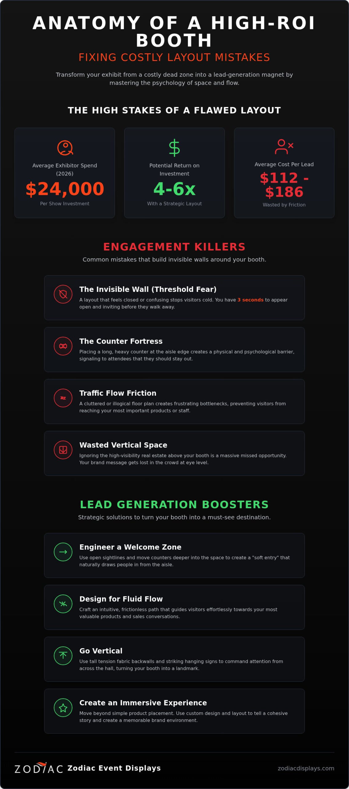
What if the reason your last exhibit felt like a ghost town wasn’t your product, but the invisible walls you built around it? It’s a painful realization when you’ve invested heavily; after all, the average exhibitor’s per-show spending in 2026 has climbed to $24,000. You aren’t alone in feeling the sting of low engagement despite a premium budget. Many brands fall into the trap of common trade show booth layout mistakes, treating their floor space like a storage unit rather than a strategic stage for human connection.
We’re here to help you reclaim your visibility and turn your exhibit into a high-traffic destination. You’ll discover how to eliminate the design errors that kill engagement and learn the sophisticated secrets that high-impact brands use to dominate the floor. We’ll explore how to balance functional storage with vibrant display space, using tools like tension fabric backwalls and hanging signs to command attention from every angle. This is your roadmap to a layout that breathes, invites, and delivers the 4-6x ROI your hard work deserves. From mastering vertical scale to optimizing floor flow for 2026’s sophisticated crowds, we’ll guide you through every creative decision.
Key Takeaways
- Master the psychology of space to eliminate threshold fear and dissolve the invisible barriers that keep potential leads from entering your exhibit.
- Optimize your floor plan to remove engagement-killing bottlenecks, ensuring a fluid natural path that guides visitors toward your most critical touchpoints.
- Reclaim your vertical real estate by utilizing hanging signs and backwall displays to transform a dead ceiling into a high-visibility beacon.
- Learn how to identify and correct common trade show booth layout mistakes that dilute your brand message and stall your lead generation efforts.
- Transition from basic product placement to immersive storytelling, leveraging custom design to turn every square foot into a high-impact destination.
The High Stakes of Trade Show Booth Layout Mistakes in 2026
The modern trade show floor is no longer just a marketplace; it’s a competitive arena for attention and influence. In 2026, the average exhibitor spends $24,000 per show, yet many see these funds evaporate because of fundamental trade show booth layout mistakes. It’s a high-stakes game where your footprint is either a magnet for high-value leads or a costly dead zone. If your layout feels like a storage unit for inventory, you’re missing the massive shift toward immersive storytelling. A well-placed backwall display or a striking hanging sign can’t save a booth that feels closed off or confusing. You need a design that breathes and invites exploration from the moment a prospect enters the aisle.
Poorly planned spaces do more than just look cluttered. They actively undermine your brand’s authority. When visitors encounter friction, whether it’s a physical bottleneck or a visual mess, they associate that frustration with your brand. We’ve moved past the era of transactional booths where a table and a few brochures sufficed. Today, your exhibit must be an experiential environment that reflects the precision and vibrancy of your business. Every square foot of your booth represents a significant investment, and leaving any of it as “dead space” is a luxury no growth-minded company can afford.
Defining the Modern Trade Show ROI
Success in 2026 isn’t just about the raw number of badges scanned at the door. We’re seeing a powerful pivot toward brand sentiment and social sharing as primary metrics for success. With the average cost per lead ranging from $112 to $186, every “dead zone” in your booth is a direct hit to your bottom line. Your layout acts as the first filter for prospects. If they can’t see a clear, inviting path to engagement, they’ll simply keep walking. Friction in the visitor journey, such as poorly placed banner stands or cramped entryways, creates a psychological barrier that even the most talented sales team can’t overcome. A strategic layout ensures that every square foot works to build trust and excitement.
The Evolution of Attendee Expectations
Attendees today are more sophisticated and far less patient than in years past. They reject the “salesy” barriers of the old school, like high counters that act as physical walls between them and your brand. Instead, they crave open, accessible environments that integrate technology seamlessly while maintaining a warm, human touch. This is where a boutique agency approach provides a distinct edge over corporate giants. By partnering with experts who prioritize personalized strategy, you can avoid common trade show booth layout mistakes and create a space that feels like a destination. Your goal is to design an environment that invites discovery, using every element from custom flags to inflatables to tell a cohesive, aspirational story.
The Psychology of Space: Avoiding the ‘Invisible Wall’ Threshold
Imagine standing at the edge of a vibrant exhibit, curious but hesitant. This hesitation is known as threshold fear. It’s the psychological resistance visitors feel when they aren’t sure if they’re welcome to step off the aisle and into your brand’s world. One of the most damaging trade show booth layout mistakes is failing to address this invisible wall. It isn’t a physical barrier, yet it stops prospects just as effectively as a locked door. You have roughly three seconds to convince a passerby that your space is worth their time. If your layout feels restrictive or overly formal, they’ll keep walking toward your competitor’s more inviting setup.
Dissolving this psychological barrier requires a shift in perspective. You aren’t just arranging furniture; you’re engineering a hospitable environment. By using psychological triggers like open sightlines and varying heights, you can lower the barrier to entry. This invites visitors to transition seamlessly from the busy aisle into your curated experience. When your space feels like a natural extension of the walkway, engagement rates naturally climb.
The Counter Trap: Barrier vs. Welcome Desk
Placing a long, heavy counter right at the aisle edge is a classic layout error. While it might feel like a professional welcome desk, it actually acts as a fortress. It signals to the attendee that they should stay on the carpet while staff remains behind the “safety” of the furniture. To fix this, move branded counters deeper into the booth. This creates a soft entry that encourages deep exploration. You can use custom flags or low-profile banner stands to guide the eye without blocking the physical path. Avoiding these trade show booth layout mistakes is about more than aesthetics; it’s about making your brand feel accessible. Our team at Zodiac specializes in crafting layouts that invite exploration, ensuring your space feels open and high-impact.
Staff Positioning and Body Language Layout
Staff huddling is another engagement killer that many brands overlook. When three or four team members stand together in the center of the booth, they create an impenetrable wall of body language. It’s intimidating for an attendee to break into that circle. Instead, design specific conversation zones that feel natural rather than forced. Use backwall displays to provide a professional backdrop, allowing staff to stand at an angle that invites interaction. Conducting a strategic analysis of your team’s positioning can turn a stagnant space into a vibrant hub of activity. When your layout supports human connection, the invisible wall disappears, leaving room for authentic growth.
Traffic Flow Friction: When Your Floor Plan Blocks Your ROI
A poorly conceived floor plan acts like a series of speed bumps for your prospects. One of the most common trade show booth layout mistakes is creating the “bottleneck” effect. This happens when high-engagement furniture, like interactive demos or lead-capture kiosks, is placed too close to the aisle. Instead of inviting people in, you create a physical clog that forces passersby to walk around your booth rather than through it. Your floor plan should be a fluid roadmap that guides visitors on a journey from curiosity to commitment. Establishing a clear visual hierarchy through your floor plan ensures that visitors know exactly where to look first and where to move next.
Mapping the “natural path” is essential for maximizing your footprint. In a standard 10×10 space, visitors typically navigate in a shallow “U” or diagonal pattern. If you hide your most high-impact assets in the back corners, they’ll likely never be seen. Conversely, a 20×20 island allows for 360-degree access, but it requires careful use of negative space. You shouldn’t feel the need to fill every inch with hardware. Negative space provides the “breathing room” necessary for comfortable conversations. When your booth feels airy and organized, it signals a premium brand experience that respects the visitor’s comfort. Our team at Zodiac designs layouts that prioritize this flow, ensuring your most valuable assets are positioned for maximum visibility.
Zoning for Success: Demo, Discovery, and Deal-Making
Think of your booth as a series of functional zones. The front area is for “Discovery,” where eye-catching tension fabric displays grab attention. As visitors move deeper, they should encounter “Demo” zones where hands-on interaction happens. Finally, the back of the booth is reserved for “Deal-Making,” a quieter area for serious consultation. Using overhead hanging signs is a masterstroke here; they act as a distant beacon, guiding traffic toward your specific location from across the crowded hall. This logical progression prevents your booth from feeling like a chaotic jumble of messages.
The Storage Dilemma: Managing Mess Without Sacrificing Space
Nothing kills a premium brand perception faster than visible clutter. Using back corners to stack cardboard boxes or personal items is a major layout fail. Instead, integrate hidden storage directly into your custom trade show graphics and counters. Strategic design allows you to tuck away lead-gen materials and personal belongings without sacrificing valuable square footage. A clean, streamlined booth isn’t just about aesthetics. It’s a fundamental requirement for a high-impact environment that invites prospects to stay longer and engage deeper.
Sensory and Technical Layout Fails: Beyond the Floor Plan
Strategic design extends far beyond the carpet tiles. Even the most fluid floor plan can collapse if you ignore the sensory and technical layers that define a modern exhibit. One of the most frequent trade show booth layout mistakes is a total failure of visual hierarchy. When your backwall displays are cluttered with a sea of text, your core message drowns. Prospects shouldn’t have to work to understand who you are. Your layout must guide their eyes from a distance to a specific focal point, using scale and contrast to establish authority immediately.
Technical placement is equally critical. We often see high-end screens positioned where venue lighting creates an unreadable glare, or where the crowd watching a video blocks the main entry path. These friction points are subtle but lethal to your ROI. By integrating technology into the flow rather than tacking it on, you ensure that digital elements enhance the journey instead of obstructing it. Every element, from your table cloths to your inflatables, must work in harmony to support a singular, powerful brand narrative. This level of precision is what separates a generic vendor from a visionary leader on the floor.
Owning the Air with Hanging Signs
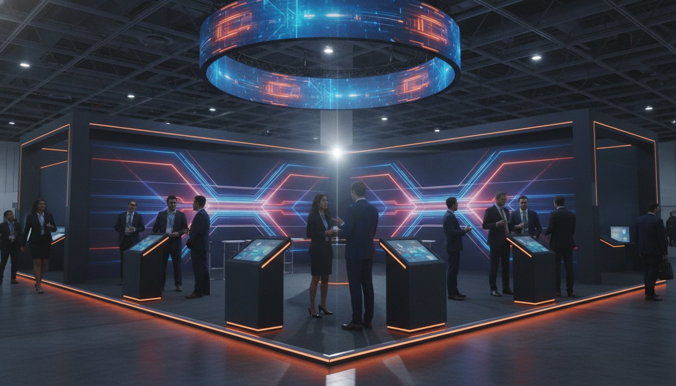
Failing to utilize vertical space is the number one mistake in large exhibition halls. In a sea of 10×10 and 20×20 footprints, the “dead ceiling” above your booth is wasted real estate. Overhead hanging signs act as a 360-degree beacon, ensuring your brand is visible from the moment attendees enter the hall. Strategic height placement is essential. For instance, at major events like IMTS 2026, where hanging signs must be approved by June 30, 2026, planning for vertical scale early is a competitive necessity. You must link this overhead branding to your ground-level layout to create a cohesive 3D environment. This vertical dominance prevents you from being swallowed by larger neighbors and establishes your booth as a landmark destination.
Lighting for Atmosphere and Direction
Relying on harsh, generic venue lighting is a missed opportunity for sophisticated branding. Light is a powerful layout tool that can define paths and highlight “hero” products with precision. Using backlit displays draws the eye naturally toward your most important offerings, creating a sense of drama and quality. The temperature of your light also matters. Warm tones invite approachability and trust, while cooler tones suggest innovation and tech-forward thinking. When you master these sensory details, your booth feels like a premium environment rather than just a temporary stall. Ready to elevate your presence? Explore our full-service design and fabrication options to ensure your next exhibit hits every mark.
The Zodiac Strategy: Partnering for Layout Mastery
Avoiding trade show booth layout mistakes isn’t just about moving a table or shifting a banner. It’s about re-engineering the entire visitor experience to align with your brand’s highest aspirations. At Zodiac Event Displays, we don’t just provide hardware; we act as a visionary extension of your creative team. Our boutique agency approach ensures that every backwall display and hanging sign is positioned with strategic intent. We understand that in a high-stakes environment, your exhibit needs to be more than a physical space. It must be a high-energy destination that commands attention and fosters authentic connection.
Sustainability is no longer just a buzzword; it’s a core requirement for modern brand authority. With 78% of organizers aiming for carbon-neutral events by 2030, your layout must reflect these values. We’ve seen a 50% rise in the use of sustainable materials in booth designs throughout 2026. Our strategy integrates eco-friendly modularity into your layout, allowing you to scale your presence without increasing your environmental footprint. This commitment to conscious design ensures your brand remains relevant and respected in an increasingly green-focused industry.
Custom Fabrication vs. Out-of-the-Box Limitations
Generic booth kits are often the primary source of common trade show booth layout mistakes. These one-size-fits-all solutions rarely account for your specific business goals or the unique traffic patterns of different venues. They often lead to cramped entries or wasted corners that kill engagement. Custom fabrication allows us to tailor your environment to your exact needs. By designing heavy-duty custom assets, we ensure your booth is durable enough for long-term event cycles while maintaining a premium, polished look. Whether it’s a precision-engineered backwall or a custom inflatable, every piece is crafted to maximize your specific square footage.
From Concept to Global Delivery
Zodiac manages the entire creative journey, from the initial design audit to the final technical setup on the show floor. This end-to-end management is vital for maintaining brand consistency as you move between different event scales and locations. Whether you’re exhibiting in Denver or at a major international hall, our global delivery and fabrication network ensures your layout works perfectly in any venue. We handle the complexities of logistics and layout optimization so you can focus on building relationships and closing deals. Ready to transform your exhibit from a standard stall into a high-impact powerhouse? Contact Zodiac Event Displays today for a comprehensive layout audit and start your journey toward trade show dominance.
Elevate Your Exhibit Strategy
Your journey from a standard vendor to a visionary leader on the floor starts with a shift in perspective. We’ve explored how mastering the psychology of space and reclaiming your vertical real estate can dissolve the invisible walls that stall engagement. By prioritizing fluid traffic flow and sensory precision, you transform your footprint into a high-impact destination rather than a storage solution. Avoiding common trade show booth layout mistakes is the first step toward securing the premium ROI that top-tier exhibitors achieve.
Zodiac Event Displays is here to act as your strategic ally. As a boutique Denver agency with global reach, we bring over a decade of high-impact event branding experience to every partnership. Our full-service design and fabrication mastery ensures that your vision is executed with technical excellence and vibrant scale. It’s time to leave the cluttered, transactional booths of the past behind and step into an experiential environment that truly reflects your brand’s growth. Ready to dominate your next event? Get a custom trade show display quote from Zodiac today.
The stage is set for your most successful year yet. Let’s build something unforgettable together.
Expert Insights: Frequently Asked Questions
What is the most common mistake in a 10×10 trade show booth layout?
The most frequent error is placing a large counter right at the front aisle edge. This creates a physical and psychological barrier that prevents attendees from stepping inside. In a compact 10×10 space, you need to maximize every square inch for interaction. Avoid these trade show booth layout mistakes by keeping the entry open and using slim banner stands to guide the eye instead of blocking the path.
How much open space should I leave in my trade show booth?
Aim to leave at least 40% of your total floor area as open space. This negative space is essential for comfortable movement and prevents your exhibit from feeling like a storage unit. When a booth is too crowded, visitors feel claustrophobic and will likely bypass your display for a more inviting neighbor. Open space signals a premium brand experience that values the attendee’s comfort and time.
Where should I place my lead generation counter for maximum impact?
Position your lead generation counter toward the middle or back of your booth footprint. Placing it at the very front acts as a stop sign rather than an invitation. By moving it deeper, you encourage prospects to fully enter your environment, giving them more time to engage with your backwall displays and brand messaging. This strategic placement increases dwell time and improves the quality of your lead interactions.
How can I make a small booth look bigger through layout design?
Utilize a minimalist design with light colors and slim-profile furniture to create an illusion of scale. High-impact backwall displays with clean graphics help the space feel expansive rather than cluttered. You should also focus on verticality. Even if you can’t use a hanging sign, utilizing the full 8-foot height limit for your backwalls draws the eye upward, making the entire footprint feel more significant and authoritative.
Should I use a hanging sign for a small 10×10 booth space?
Check your specific exhibitor manual first, as many venues restrict hanging signs to larger island or peninsula booths. For a standard 10×10 booth, the height limit is typically capped at 8 feet. Instead of a hanging sign, focus on maximizing your vertical impact with a vibrant tension fabric backwall or custom flags that stay within the permitted height while still commanding attention from the busy show floor aisle.
How does booth layout affect my trade show ROI?
Booth layout directly dictates the flow of traffic and the duration of visitor engagement. A strategic floor plan eliminates bottlenecks and ensures that your most high-value assets are seen first. By avoiding common trade show booth layout mistakes, you can achieve a 4-6x return on your program spend. A well-designed space converts passive passersby into qualified leads, ensuring your show investment delivers measurable business growth.
What are the best ways to hide storage in a custom booth layout?
Integrate storage directly into your functional furniture, such as counters with internal shelving or backwall displays with hidden access points. Utilizing the space behind a tension fabric wall is a masterstroke for keeping personal items and extra lead-gen materials out of sight. A clean, uncluttered booth is a prerequisite for a premium brand perception, ensuring your team stays organized without sacrificing any valuable engagement space.
How do I choose between a modular or custom booth layout?
Choose a custom layout if your primary goal is immersive storytelling and unique brand differentiation. While modular kits offer some flexibility, they often lack the durability and specific tailoring required for high-impact exhibits. A custom approach allows you to engineer every square foot for your specific sales journey. If you participate in multiple high-stakes shows annually, the long-term ROI of a custom-fabricated asset outweighs the initial convenience of generic kits.

 Previous reading