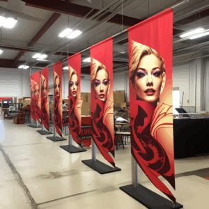
Creating a compelling visual presence at trade shows is crucial for making a lasting impression on potential clients and partners. A trade show banner is often the first point of engagement and can effectively communicate your brand’s message, values, and products to an audience. With the right trade show banner design inspiration, your display can capture attention, convey professionalism, and drive traffic to your booth.
As a starting point, consider the core objectives of your presence at the event. Are you launching a new product, seeking to increase brand awareness, or looking to network with industry leaders? Your banner’s design should align with these goals, utilizing a mix of eye-catching graphics, clear messaging, and strategic branding elements.
At Zodiac Event Displays, we understand that an exceptional banner can set the tone for your entire exhibit. That’s why we offer tailor-made solutions that reflect your unique brand identity and resonate with your target audience. For personalized assistance and to amplify your event marketing, send a message to info@zodiacdisplays.com.
The Psychology of Color in Banner Design
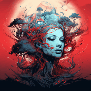
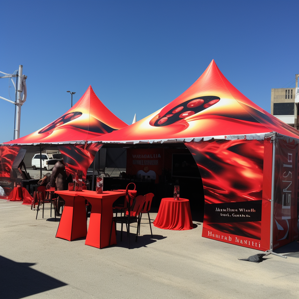
Color is a powerful psychological tool in banner design that can significantly impact attendee behavior and perception at trade shows. Each hue evokes a specific emotional response and can convey different meanings across various cultures. Understanding the psychology of color is essential when seeking trade show banner design inspiration. For instance, blue is often associated with trust and professionalism, making it a popular choice for businesses that want to establish credibility. Red, on the other hand, is an attention-grabbing color that can stimulate excitement and urgency, ideal for promotions or sales-driven messages.
When selecting colors for your trade show banner, it’s important to consider your brand’s existing color palette to maintain consistency. However, you can also introduce contrasting colors or accents to highlight key areas or calls to action within your design. Keep in mind that the use of color should enhance the overall readability and visibility of your banner, ensuring that your message is easily discernible from a distance.
It’s also critical to be aware of the lighting conditions of the trade show venue, as this can affect how your colors are perceived. Vibrant and high-saturation colors may stand out better in well-lit spaces, while softer tones might be more appropriate for dimly lit environments or to convey a sense of luxury and exclusivity.
Incorporating Brand Identity into Your Banner
A trade show is an extension of your brand’s story, and your banner acts as a silent ambassador to all attendees. To ensure that your banner effectively communicates your brand identity, it is vital to incorporate elements that are quintessential to your brand. This includes your logo, which should be prominently placed to immediately draw the eye and foster brand recognition. Consistent use of your brand’s colors and fonts is also crucial, as these visual components reinforce brand identity and help to create a cohesive look across all marketing materials.
Moreover, incorporating your brand’s tagline or mission statement into the banner design can succinctly convey your company’s core values and offerings. This messaging should be clear, concise, and aligned with the overall theme of your trade show presence. Imagery and graphics used should resonate with your brand’s aesthetic and appeal to your target audience, further solidifying the connection between your display and your brand’s image.
By ensuring that every aspect of your banner’s design is a reflection of your brand, you create a memorable and impactful presence at the trade show. Not only does this help in attracting the right audience to your booth, but it also aids in building a lasting impression that extends beyond the event itself. When your banner successfully communicates your brand identity, it becomes more than just a visual; it becomes a pivotal piece of your brand’s narrative.
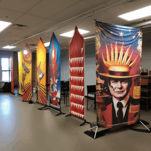
Creative Use of Images and Graphics

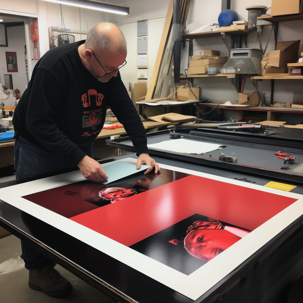
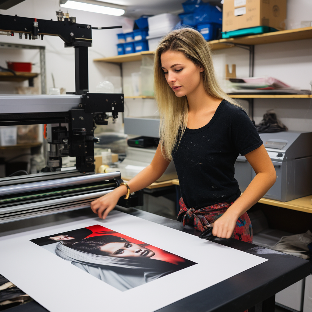
Images and graphics are the cornerstone of effective trade show banners, offering a visual narrative that can captivate and engage your audience. When seeking trade show banner design inspiration, consider the creative use of high-quality, relevant images that tell a story about your brand or products. Vivid, eye-catching graphics can illustrate the benefits of your offerings or showcase your products in action, creating an emotional connection with the viewer.
Dynamic imagery can also be used to create a sense of movement and energy, drawing the eye and encouraging attendees to take a closer look. When selecting images, it’s crucial to consider their relevance to your message and their ability to stand out in a bustling trade show environment. The use of bold, large-scale graphics can make a statement, while more subtle, intricate designs can intrigue and invite closer inspection.
Incorporating infographics or data visualization into your trade show banner can also be a powerful tool. These elements can distill complex information into an easily digestible format, making it quick and easy for attendees to understand the value proposition of your products or services.
Ultimately, the creative use of images and graphics in your trade show banner should align with your overall design concept and marketing goals. They should complement the text and branding elements, creating a harmonious and impactful display that leaves a lasting impression on the event’s attendees.
Typography Techniques for Readable Banners
Typography is a critical element in banner design, as it significantly affects readability and viewer engagement. When delving into trade show banner design inspiration, it’s essential to select typefaces that are not only visually appealing but also easy to read from various distances. A good rule of thumb is to use sans-serif fonts for headlines due to their clean and modern appearance, which improves legibility, especially in crowded trade show environments.
To enhance the hierarchy of information, vary font sizes and weights to draw attention to key messages. Bold or larger fonts can be used for the main headline, while secondary information can be presented in a smaller size or lighter weight. This technique guides the viewer’s eye through the content systematically, ensuring they receive the intended message.
Additionally, consider the spacing between letters and lines, known as kerning and leading. Proper spacing prevents the text from appearing cluttered and helps maintain readability. Colors also play a vital role in typography; contrasting colors can make text stand out against the background, but be mindful to maintain brand consistency and readability.
Remember, the goal is to quickly and effectively communicate your message to trade show attendees. A well-thought-out typographical approach will not only convey your information clearly but also contribute to the overall aesthetic appeal of your banner, making it a memorable piece of your event marketing strategy.
Strategic Banner Placement for Maximum Impact
Once you have a visually captivating banner, strategic placement is paramount to maximize its impact at a trade show. Consider the flow of traffic and sight lines when determining where to place your banner. High-traffic areas, such as entrances, food courts, or near large installations, can ensure more eyes on your brand. However, it’s crucial to balance visibility with the attendees’ ability to comfortably absorb the information without obstruction.
Height placement is also an essential aspect to consider. Banners should be elevated to stand out amongst the crowd, but not so high that they’re disconnected from the associated booth or display. Ideally, the top of your banner should be visible over the heads of attendees, while the main messaging is at eye level.
Angle your banners towards walkways or seating areas where people naturally pause, as this increases the likelihood of prolonged engagement. Additionally, if your trade show is in a large venue, multiple banners placed at different locations can help reinforce your message and guide visitors to your main display.
Finally, ensure your banners are securely fastened and positioned to avoid any safety hazards while still capturing attention. Remember, the placement of your banner can be as influential as the design itself in your event marketing success.
Ready to make your mark at the next trade show? Send a message to info@zodiacdisplays.com to amplify your event marketing with banners that are both visually stunning and strategically placed for maximum impact.
 Previous reading