Creating an eye-catching event banner is not just about slapping together colorful images and text. It’s an art form that requires careful consideration of design elements, brand messaging, and the event’s overall theme. To start off, it’s crucial to understand that your banner serves as a visual shout-out to your audience, beckoning them to take notice and engage with your brand. Hence, event banner design ideas should be both innovative and reflective of the brand’s identity.
Begin by considering the purpose of your event banner. Is it to inform, excite, or entice? The goal will guide the design process, ensuring that every element from typography to color palette aligns with the intended message. Vibrant colors can evoke excitement and draw attention, while more subdued tones might be suitable for conveying a message of elegance and sophistication. Meanwhile, the strategic use of branding elements, like logos and taglines, reinforces brand recognition. Don’t forget to integrate event-specific details such as dates, locations, and calls to action in a clear and concise manner.
Remember, a well-designed event banner has the power to transform a space and create a lasting impression on attendees. It should be more than just visually appealing; it should also be a strategic tool in your event marketing arsenal. If you’re looking to amplify your event marketing, consider reaching out to the experts. Send message to info@zodiacdisplays.com and let Zodiac Event Displays help you create banners that truly stand out.
Incorporating Brand Identity into Your Banner Design
Integrating your brand identity into the design of your event banners is essential for creating a cohesive and memorable experience for your audience. This involves more than just displaying your logo prominently. It’s about weaving the very essence of your brand throughout every aspect of the banner’s design. Consider the colors, fonts, and imagery that are synonymous with your brand, and ensure these are front and center in your banner’s aesthetic.
Color schemes should complement your logo and be consistent with your brand’s palette to maintain uniformity. This visual consistency helps to reinforce brand recall among your audience. Similarly, typography plays a crucial role; select fonts that reflect your brand’s character, whether it’s professional, whimsical, or cutting-edge. Consistent use of these fonts across all marketing materials, including your event banners, solidifies the voice and tone of your brand.
Imagery and graphics should be selected with your brand’s narrative in mind. Whether it’s aspirational lifestyle photos, abstract designs, or product imagery, ensure that what you choose to display aligns with the story your brand aims to tell. By thoughtfully incorporating these elements, your event banners become a powerful extension of your brand identity, creating an immersive experience that resonates with attendees and leaves a lasting impact on how your brand is perceived.
Choosing the Right Color Scheme for Maximum Impact
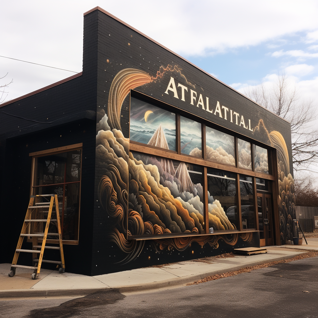
The choice of color scheme for your event banners can have a profound effect on the mood and engagement levels of your audience. Colors evoke emotions and can significantly influence perception. To achieve maximum impact, it’s crucial to understand color psychology and how different hues can affect the atmosphere of your event. Vibrant reds can energize and stimulate action, while cool blues may convey trust and professionalism. A palette of greens can emphasize growth and freshness, and purples may be used to suggest luxury and creativity.
When selecting colors, also consider the context of your event and the message you wish to convey. Contrasting colors can make your banner stand out and ensure that your message is legible from a distance. However, it’s important to avoid color combinations that clash or are difficult to read. The use of complementary colors, or those opposite each other on the color wheel, can create a dynamic and visually appealing banner.
Remember that color can also be a powerful tool for brand recognition. Ensure that your chosen color scheme aligns with your existing brand colors to reinforce brand identity. Additionally, take into account the lighting of the event space and how natural and artificial light may alter the appearance of your colors. A well-thought-out color scheme that’s tailored to your event and brand will not only catch the eye but will also leave a lasting impression on your audience.
Creative Use of Typography in Event Banners
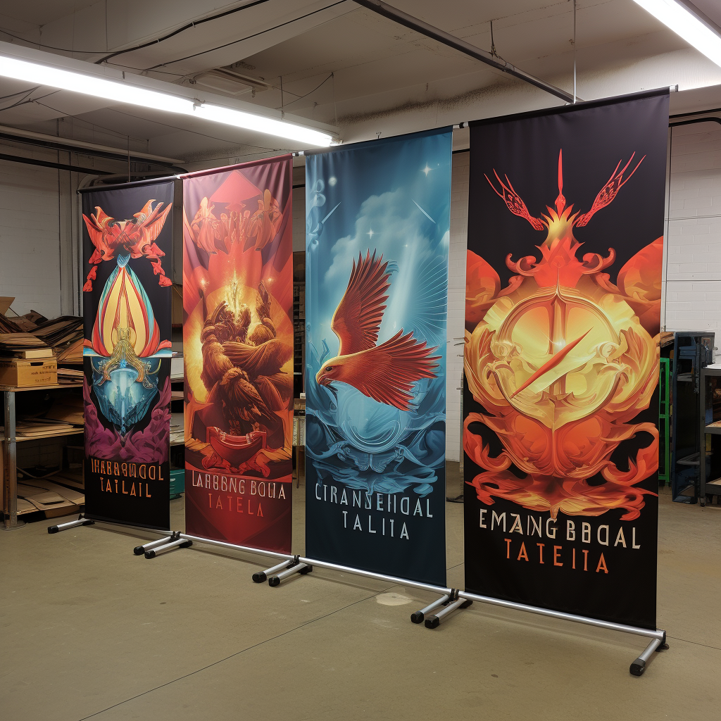
Typography is an essential element in banner design that goes beyond simply conveying a message. It plays a pivotal role in creating an aesthetic appeal and can greatly influence how your audience perceives your brand. Creative use of typography can help your event banners stand out and resonate with the viewers. When exploring event banner design ideas, consider the font style, size, and arrangement to enhance visual interest and readability.
Experimenting with bold font choices can capture attention, while mixing font weights and styles can guide the viewer’s eye to the most important information. It’s crucial, though, to maintain a balance; too many typefaces can overwhelm and confuse. Stick to a limited font palette to keep your design cohesive. Additionally, consider the emotional impact of different typefaces—serif fonts tend to evoke a sense of tradition, whereas sans-serif fonts are perceived as modern and clean.
The arrangement of text is another tool for creative expression. Text hierarchy is vital and should be strategically planned to ensure that the key messages are prioritized. Play with spacing, alignment, and direction to create dynamic compositions. For instance, vertical text can add a unique touch and is especially effective for narrow spaces. However, readability should always be a top priority; make sure that your typography remains legible from various distances and angles.
By thoughtfully integrating typography into your event banners, you can craft a design that not only informs but also delights and engages your audience. The right typographic treatment can transform a simple banner into a powerful brand statement.
Innovative Layouts and Imagery for Engaging Displays
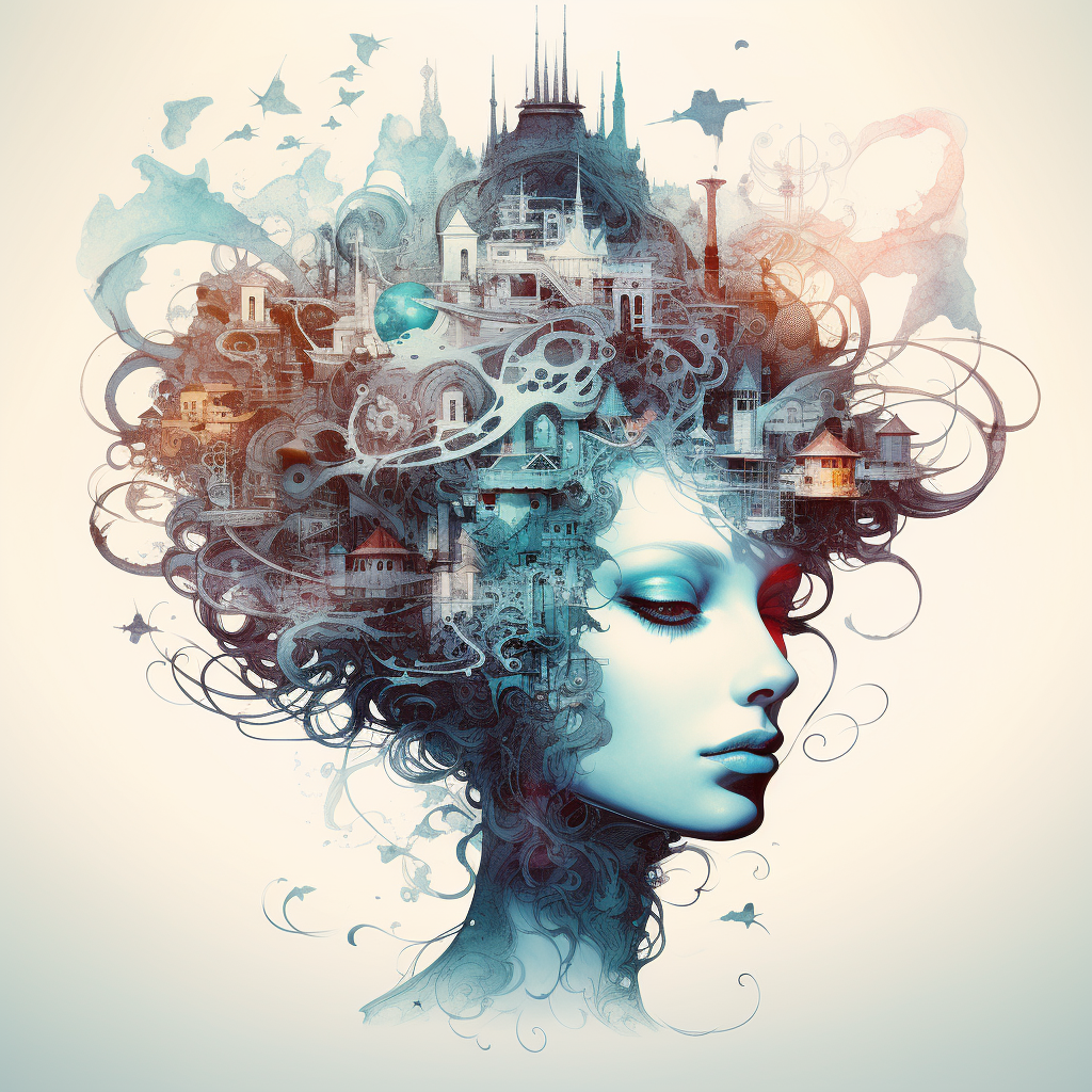
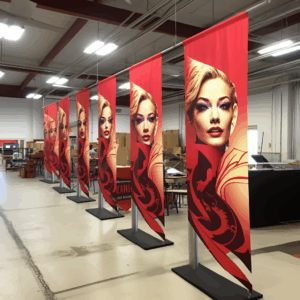
The layout of an event banner plays a critical role in the overall impact it makes on the audience. Innovative layouts go beyond the standard rectangular format and explore shapes and configurations that can capture interest and guide the viewer’s eye. When considering event banner design ideas, think about how the arrangement of elements on the banner can tell a story or emphasize the most important message. Asymmetrical layouts can be dynamic and exciting, while symmetrical arrangements offer a sense of balance and formality.
Imagery is another powerful tool in the banner design arsenal. The use of high-quality, evocative images can convey your brand’s message without words. When selecting images, keep in mind the theme of your event and the emotions you want to evoke. A striking, singular image can have a memorable impact, while a collage of images can illustrate a more complex story or show the diversity of your brand.
Combining innovative layouts with compelling imagery requires a careful balance to ensure that the banner doesn’t become cluttered or confusing. White space, or negative space, is an often-underestimated element that can help to create a clean and focused design. It gives the viewer’s eyes a place to rest and can help to emphasize the most important parts of your banner.
Ultimately, the key to an engaging display is to create a harmony between the various elements of your design. By utilizing innovative layouts and impactful imagery, your event banners can capture the audience’s attention and leave a lasting impression.
Trends in Digital and Interactive Banner Designs
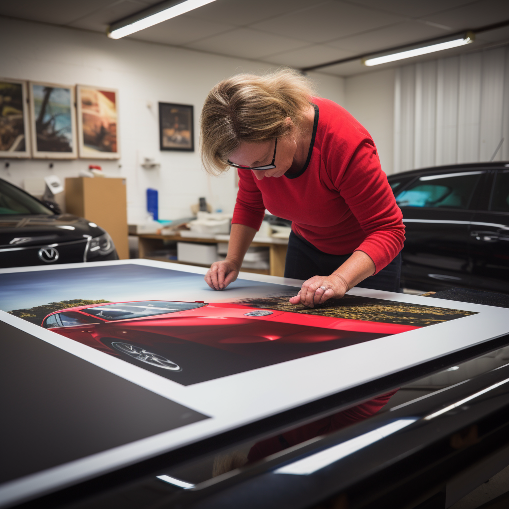
Digital and interactive banner designs represent the cutting edge of event signage, offering an unparalleled level of engagement with the audience. Augmented reality (AR) banners, for example, can transform a simple design into an interactive experience, allowing viewers to engage with your brand in a memorable way through their smartphones. Another trend is the use of QR codes, which can be scanned to reveal exclusive content, special offers, or more detailed information about your brand or product.
Video banners are also gaining popularity, as they can convey a vast amount of information in a short time and capture attention in a busy event environment. Looping videos or animations can tell a story about your brand or product without requiring any action from the viewer. However, it is important to ensure that the content is optimized for silent playback, as events can be noisy places where audio is often lost.
These digital trends are not only about wowing the audience with technology but also about creating a more immersive and interactive brand experience. As technology continues to advance, we can expect to see even more innovative uses of digital displays in event signage.
Ready to incorporate these cutting-edge event banner design ideas into your next marketing effort? Send a message to info@zodiacdisplays.com to amplify your event marketing and ensure that your banners stand out in the crowd.


 Previous reading