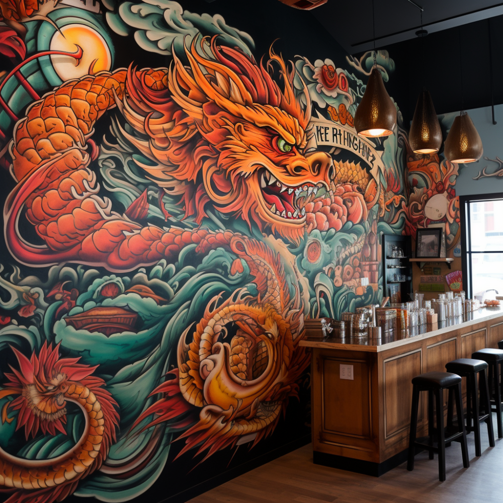
In the competitive world of events and trade shows, standing out is crucial. One effective way to capture attention is through eye-catching marketing banners for booths. These banners not only draw attendees to your booth but also help communicate your brand’s message succinctly and effectively. Whether you’re a small startup or a well-established company, investing in high-quality marketing banners can significantly impact your booth’s success.
Marketing banners serve multiple purposes, from enhancing brand visibility to conveying key information about your products or services. They act as a visual magnet, pulling in potential customers and setting the stage for meaningful interactions. When designed thoughtfully, these banners can leave a lasting impression, making your booth memorable long after the event has ended.
At Zodiac Event Displays, we specialize in creating dye sublimated fabric displays that are not only vibrant and durable but also customized to reflect your brand’s unique identity. Our team of experienced professionals is dedicated to helping you make the most of your event marketing efforts.
Send a message to info@zodiacdisplays.com to amplify your event marketing.
Importance of Eye-Catching Booth Banners
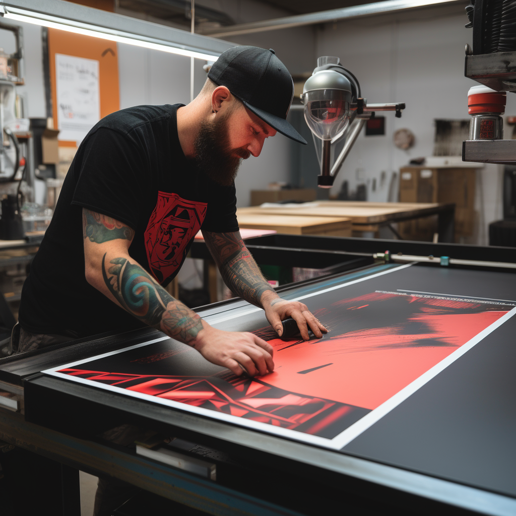
The significance of eye-catching booth banners cannot be overstated. In bustling environments like trade shows and conventions, businesses are often competing for the same audience’s attention. An attractive and well-designed banner can serve as a powerful beacon, guiding attendees to your booth amidst a sea of competitors.
First impressions are crucial, and your booth banner is often the first thing potential customers will notice. A visually appealing banner with clear messaging can instantly communicate what your brand is about, what products or services you offer, and why visitors should stop by your booth. This initial attraction can lead to increased foot traffic, more meaningful interactions, and ultimately, higher conversion rates.
Moreover, a well-crafted booth banner reinforces your brand identity. Consistent use of colors, logos, and taglines across all marketing materials helps in building brand recognition. When attendees see your banner, they should immediately associate it with your brand, fostering a sense of familiarity and trust.
In addition to attracting attention and reinforcing brand identity, eye-catching booth banners can also convey professionalism and credibility. A high-quality banner suggests that your company is established and serious about its business, which can be particularly appealing to potential clients and partners.
Investing in eye-catching booth banners is not just about aesthetics; it’s a strategic move that can pay off in terms of brand visibility, customer engagement, and business growth. By making your booth stand out, you not only draw in more visitors but also create opportunities for lasting impressions and valuable connections.
Design Tips for Effective Booth Banners
Creating an effective booth banner requires a blend of creativity and strategic thinking. Here are some essential design tips to ensure your booth banners are both visually appealing and functionally effective:
1. Keep It Simple: The key to a successful banner is simplicity. Avoid cluttering the banner with too much information. Instead, focus on a single, clear message that can be quickly understood at a glance. Use concise text and bold visuals to convey your main points.
2. Use High-Quality Images: Ensure that any images used are high-resolution and professionally shot. Blurry or pixelated images can detract from the overall quality of your banner and diminish your brand’s credibility.
3. Prioritize Readability: Choose fonts that are easy to read from a distance. Avoid overly decorative fonts that can be difficult to decipher. Stick to a maximum of two or three different fonts to maintain a clean and cohesive look.
4. Strategic Use of Colors: Colors can evoke emotions and influence perceptions. Use your brand’s color palette to maintain consistency and enhance brand recognition. Complementary colors can make your text and images stand out, but be cautious not to use colors that may clash or overwhelm.
5. Incorporate Your Logo and Branding: Prominently display your logo and ensure that your branding elements are consistent across all materials. This helps in building brand awareness and makes your booth easily identifiable.
6. Focus on the Hierarchy of Information: Arrange the information on your banner in a hierarchical manner. The most important information, such as your headline or key message, should be at the top, followed by supporting details. This guides the viewer’s eye naturally through the content.
7. Utilize White Space: Do not underestimate the power of white space. It helps in making your banner look organized and ensures that the key elements stand out. Overcrowding your banner can lead to a chaotic appearance and dilute your message.
By following these design tips, you can create booth banners that not only attract attention but also effectively communicate your brand’s message. Remember, the goal is to make a lasting impression, so invest the time and effort into crafting a banner that truly represents your brand.
Choosing the Right Materials for Banners
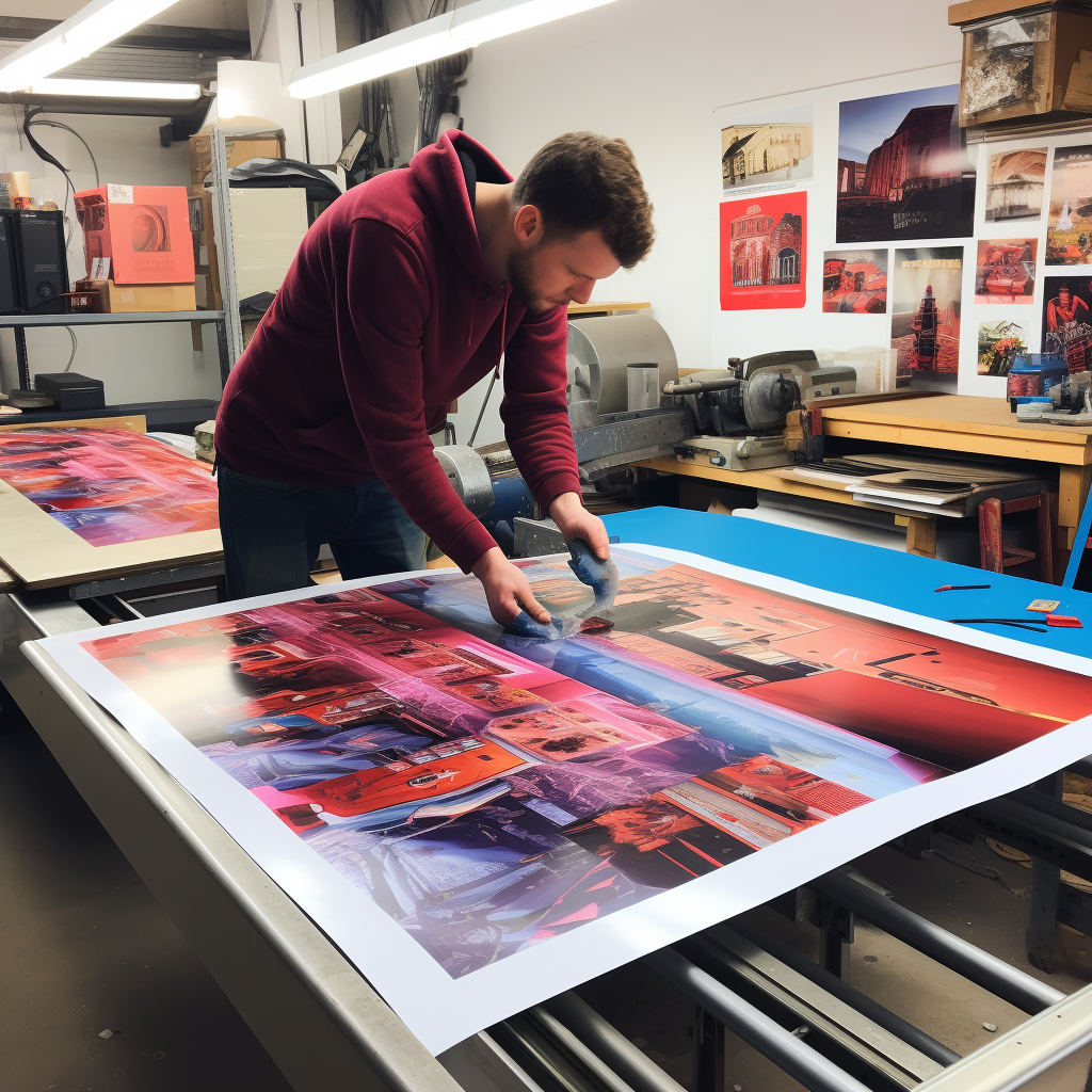
Selecting the appropriate materials for your marketing banners for booths is crucial to ensure durability, visual appeal, and effectiveness. With a variety of materials available, making the right choice can significantly impact the success of your promotional efforts. Here are some key considerations:
1. Vinyl: Vinyl is a popular choice for banners due to its durability and versatility. It is water-resistant and can withstand various weather conditions, making it ideal for both indoor and outdoor events. Vinyl banners can also be easily rolled up and transported, adding to their convenience.
2. Fabric: Fabric banners offer a more upscale and professional look. They are lightweight and can be folded, reducing the risk of creases compared to vinyl. Fabric banners are often used for indoor events and can be printed using dye sublimation, which ensures vibrant and long-lasting colors.
3. Mesh: Mesh banners are designed for outdoor use, especially in windy conditions. The tiny holes in the mesh material allow wind to pass through, reducing the risk of the banner tearing or becoming a safety hazard. Despite the perforations, mesh banners still provide excellent image quality and readability.
4. Canvas: Canvas banners exude a high-end, artistic feel. They are typically used for indoor displays and can add a touch of elegance to any booth. Canvas is durable and offers excellent print quality, making it a great choice for showcasing detailed graphics and artwork.
5. Polypropylene: This is a synthetic material that is both lightweight and durable. Polypropylene banners are resistant to water and tearing, making them suitable for a variety of environments. They are also eco-friendly, as they can be recycled, aligning with sustainable marketing practices.
6. Paper: While less durable than other materials, paper banners can be a cost-effective option for short-term indoor events. They are lightweight and easy to dispose of, but they lack the durability required for long-term or outdoor use.
When choosing the right material for your banners, consider the event type, location, and expected duration of use. Each material has its unique benefits and can be tailored to meet specific needs. By selecting the appropriate material, you ensure that your banner not only looks great but also stands the test of time.
Placement and Setup of Booth Banners
The placement and setup of your marketing banners for booths are critical elements that can significantly influence the effectiveness of your display. Proper positioning and installation can enhance visibility, attract more visitors, and maximize the impact of your marketing efforts.
1. Strategic Placement: Position your banners in high-traffic areas where they are most likely to catch the attention of passersby. This includes entrances, main aisles, and focal points within the event space. Ensure that your banner is at eye level or slightly above to enhance visibility.
2. Layering and Angling: Use layering techniques by placing smaller banners in front of larger ones to create depth and visual interest. Angling your banners slightly towards the aisle can also help capture the attention of attendees as they walk by. Experiment with different placements to see what works best for your booth layout.
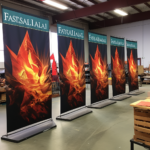
3. Sturdy Supports: Ensure your banners are securely fastened using appropriate supports such as banner stands, frames, or grommets with ropes. Sturdy supports prevent your banners from sagging, falling, or being damaged, especially in high-traffic areas or outdoor settings. For fabric banners, consider using tension fabric displays to keep them taut and wrinkle-free.
4. Lighting: Proper lighting can make a significant difference in how your banners are perceived. Use spotlights or LED lights to highlight key messages and graphics on your banners. Good lighting can enhance colors, improve readability, and make your booth more inviting.
5. Accessibility: Make sure your banners do not obstruct the flow of traffic around your booth. They should complement your booth setup without causing any inconvenience to visitors. Consider using retractable banners that can be easily adjusted or moved if needed.
6. Consistency: Maintain visual consistency across all your banners and other booth materials. Use the same color scheme, fonts, and branding elements to create a cohesive look that reinforces your brand identity. Consistency helps in building brand recognition and trust among visitors.
By carefully considering the placement and setup of your booth banners, you can create an engaging and effective display that draws in attendees and leaves a lasting impression. Remember, the goal is to make your booth stand out while providing a seamless and enjoyable experience for your visitors.
Case Studies of Successful Booth Banners
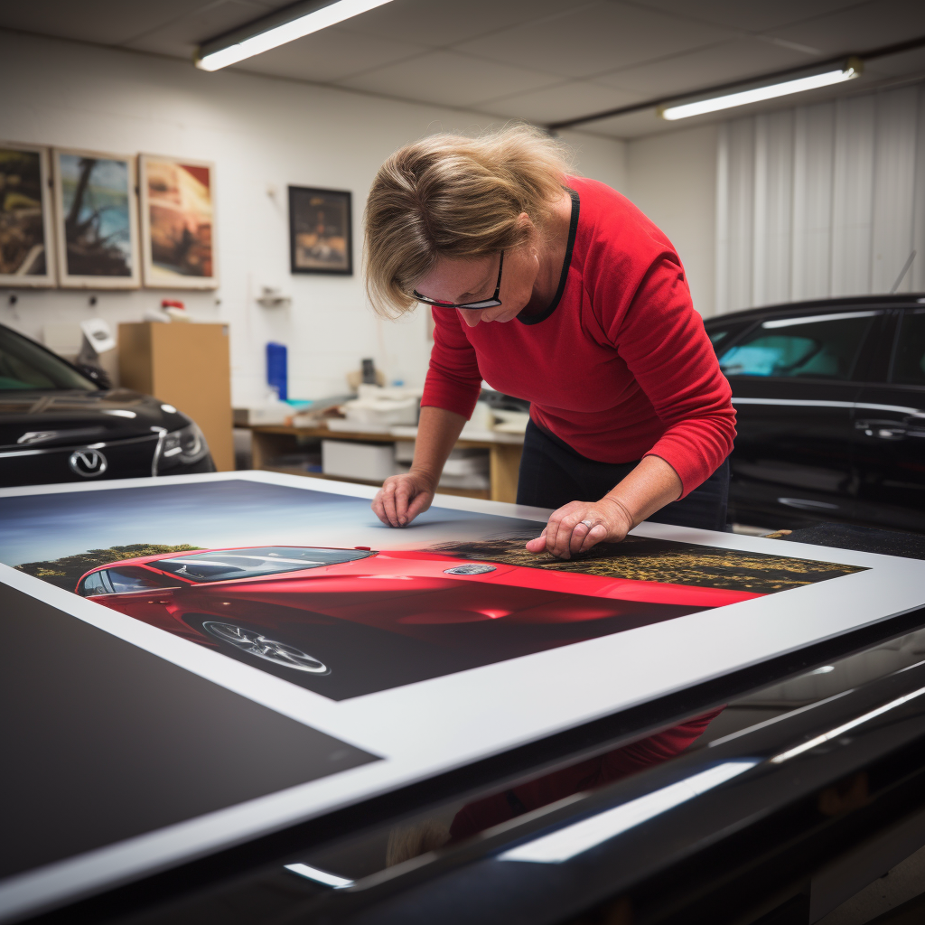
Looking at case studies of successful booth banners can provide valuable insights and inspiration for your own event marketing strategies. Real-world examples demonstrate how effective design, strategic placement, and thoughtful setup can transform a booth from ordinary to extraordinary.
1. Tech Innovators Expo: At a recent tech expo, a startup utilized double-sided fabric banners strategically placed at the corners of their booth. The vibrant graphics and concise messaging attracted a steady stream of visitors. By using LED spotlights, they highlighted their key products and services, making the booth inviting and engaging even from a distance. This setup increased foot traffic by 30% compared to their previous events.
2. Health and Wellness Fair: A health supplement company employed a series of retractable banners that told a visual story of their product benefits. Each banner was placed at different points of the booth, guiding visitors through a journey from problem identification to solution. This cohesive narrative, combined with consistent branding and professional graphics, resulted in a 40% increase in visitor engagement and product inquiries.
3. Art and Craft Festival: An artist collective used custom-shaped fabric banners to create an immersive environment at their booth. These uniquely designed banners, resembling art pieces themselves, were placed at varying heights and angles, creating a dynamic and visually stimulating space. This innovative approach not only drew large crowds but also led to a significant boost in sales and brand recognition.
These case studies highlight the importance of creativity, strategic placement, and cohesive branding in making your booth banners stand out. By analyzing successful examples, you can gather ideas and strategies to apply to your own booth, ensuring maximum visibility and engagement.
Ready to elevate your own event marketing with stunning booth banners? Send message to info@zodiacdisplays.com to amplify your event marketing.
