Welcome to another article to boost your business knowledge! Today, we dig into the world of event directional signs. Many underestimate the power these unobtrusive guides possess in enhancing the functionality and appeal of an event.
Good signage delivers more than just direction; it contributes to your event’s overall image. It spends no words, yet communicates relevant information seamlessly to the attendees, making them feel welcomed and expertly guided.
This makes the process of designing and implementing your event signage an important aspect. The dilemma lies in finding the balance between function and aesthetic, and that’s where you will discover the true artistry in well-designed event directional signs. This post aims to do just that – help you find that balance.
Ready to step up your signage game? Let’s get started…
Different Types of Event Directional Signs

Event directional signs serve as essential navigational aids during an event, effortlessly guiding guests to their designated areas. Their functionality, however, goes beyond plane directions; they reflect your event’s ambiance and can send non-verbal communications.
The most common type is the temporary directional sign, only relevant for the event’s duration. These signs are typically less permanent and recyclable.
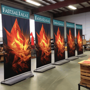
Secondly, we have the A-frame signs that are cost-effective and practical for outdoor events. Their versatility allows you to display different messages on both sides.
Lastly, the digital directional signs, that while more expensive, offer the advantage of being easily updated, making it perfect for dynamic events.
Considering your event type, audience, budget and venue, the right directional sign can invite, guide, and ultimately enhance your guests’ experiences. These various options offer flexibility that meets diverse needs.
Elements of Effectively Designed Event Directional Signs

Event directional signs play a crucial role in navigating guests seamlessly throughout the premises. Their design can make the difference between a smooth-flowing event and one marked by confusion.
The effectiveness of these signs, however, hinges on several key elements.
Firstly, legibility is paramount. Your sign’s text must be clear, large enough to read from a distance, and free of complex fonts.
Color contrast also plays an essential part in visibility. By using colors that profoundly contrast each other, you can maximize readability.
Secondly, consider location. Be strategic about where you place your signs. Ideally, they should have maximum visibility, placed at eye level or just slightly above.
Lastly, keep your messages simple and concise. You only have a few seconds to communicate with attendees, so get straight to the point.
These elements, when effectively implemented, will ensure a well-designed event directional sign.
Tips on Where to Place Your Event Directional Signs

Strategically placing your event directional signs can significantly improve the overall attendee experience. Firstly, the entrance is the primary spot for a sign. Attendees often appreciate guidance right away. Secondly, food and beverage stations, restrooms, and exits also require clear signage. You may place these signs at various visible points, like corners.
Another effective approach is placing signs at decision-making zones, such as intersections or stairwells. Closely studied sight lines also provide insight about where attendees will naturally look for guidance.
Finally, remember to foresee all the potential movements of your attendees, from their arrival to their departure. Aim to make their journey within your event venue as streamlined and simple as possible. So, put your creativity to work and think beyond the standard ‘left and right’ directional signs.
How to Create Visually Appealing Event Directional Signs

Creating visually appealing event directional signs not only guides your guests seamlessly but also showcases your professionalism.
To start with, consider your event’s color scheme. Stick to a maximum of three complementary colors, maintaining consistency is key.
Next, focus on the font. It should be bold and clear, ensuring maximum readability. From a distance, directional information should be easily understood.
Limit the text. Short, sweet, and to the point, this will prevent information overload.
Ensure the size of your sign is proportional to the venue’s size. Larger venues require larger signs for visibility.
Finally, strategically place the signs. Position them in areas with a high-traffic flow.
Remember, a well-designed directional sign not only serves its primary functional purpose but also subtly compliments your event theme.
Making Your Event Directional Signs Inclusive and Accessible
Organizing an event is not merely about creating a stunning stage or ensuring delectable food. It’s also about making it highly accessible and inclusive for everyone. This is where the power of effective and inclusive event directional signs comes in.
Consider using braille, large print, varied colors, and universally clear symbols to ensure your signs are comprehensible by all – including those with visual impairments. Leverage simple language while avoiding jargon or abbreviations that may confuse attendees.
You can also place signs at varying heights, making them easily sighted by those of different heights, children, and wheelchair users. Think about lighting too for evening events; illuminated signs can amplify readability.
Remember, a successful event is one everyone can navigate.
Why Event Directional Signs Enhance Guest Experience

Nothing elevates a guest’s experience at an event more than adequate, clear and professional signage.
These directional signs don’t merely serve as guidelines to navigate the venue; they provide a subtle but significant contribution towards enhancing the overall guest experience.
Well-placed and easily readable signs can ease potential anxieties related to the venue’s layout for a first-time visitor, thus, promoting a sense of independence to move around confidently.
Directional signs also exemplify your business’s attention to detail and concern for fostering a comfortable environment for guests.
Moreover, they are a great means to display creativity, brand relevance and professionalism. Using your brand’s color scheme, logo, and taglines on these signs reinforces brand identity and consistency.
At the end of the day, they save your guests’ time, guiding them effortlessly to where they need to be, allowing them to focus more on the event, feeling more appreciated and respected.
Achieving Brand Consistency With Event Directional Signs

Maintaining brand consistency is paramount, even when it comes to event directional signs. These signs, often overlooked, are significant touchpoints that convey your brand image.
By aligning your directional signage with your overall brand aesthetic, you reinforce brand recognition. Think about color schemes, typography, and design elements consistent with your brand’s look and feel.
Moreover, incorporate your logo subtly yet noticeably. This reinforces brand memory every time guests glance up for directions.
Remember, every interaction, as minor as wayfinding, is an opportunity to reflect your brand’s professionalism.
In essence, consistency in event directional signs is an underrated yet potent branding tool. It produces a unified brand experience, strengthening the impression your brand leaves on event attendees.
Temporary vs. Permanent Event Directional Signs: Choosing the Right Type

Whether organizing a grand conference or a small office party, directing attendees is crucial in any event. Selecting appropriate directional signs can be challenging, especially considering the options of temporary and permanent ones.
Temporary event directional signs, set up specifically for an event and dismantled post-event, offer the flexibility of easy re-positioning, making them ideal for short-term, single-site events.
On the other hand, permanent signs, usually sturdier and more expensive, are designed for prolonged use. These are perfect for multi-event venues or areas frequently used for gatherings, offering long-term savings.
Determining which is right for your event involves understanding your needs, projected frequency of usage, and budget. Remember, the best choice effortlessly guides guests, while seamlessly blending with the event’s aesthetics.


 Previous reading


