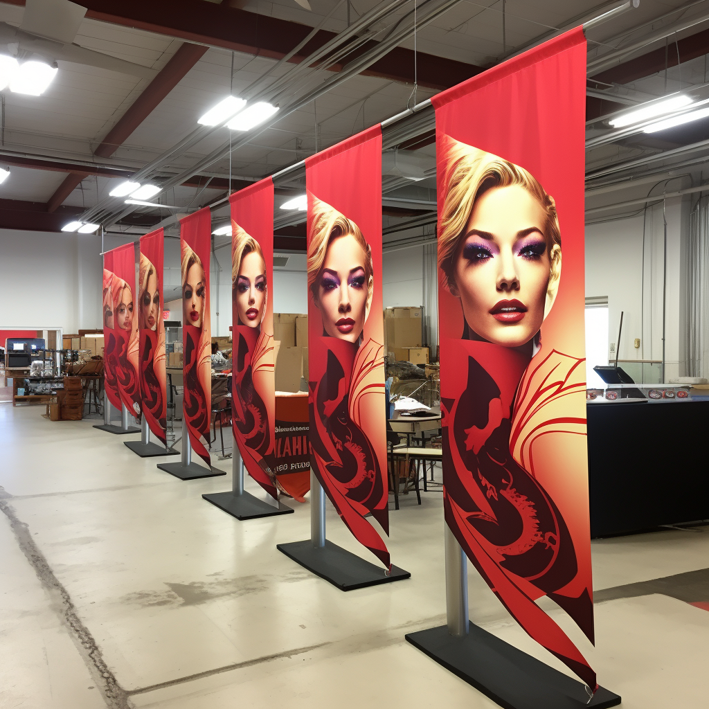
Keeping up with the latest promo banner design trends is essential for any brand looking to make a strong impression in the bustling event marketing landscape. A well-designed promo banner can be a game-changer, capturing the attention of potential customers and conveying your message effectively. One trend that has been gaining traction is the use of bold, vibrant colors that stand out in crowded event spaces. These high-contrast designs are not only visually arresting but also enhance brand recognition.
Another notable trend is the incorporation of interactive elements into banners. QR codes, for instance, invite attendees to engage with the brand on a deeper level by directing them to a website or exclusive offers. Minimalistic design is also on the rise, with brands opting for clean, uncluttered layouts that communicate their message succinctly. This approach pairs well with high-quality, impactful images that tell a story at a glance. Furthermore, integrating eco-conscious materials and messaging reflects a brand’s commitment to sustainability, a value that resonates with a growing segment of consumers.
To ensure your brand stays ahead of the curve with an eye-catching display, consider these promo banner examples as a source of inspiration for your next campaign. Not sure where to start? Send a message to info@zodiacdisplays.com to amplify your event marketing with Zodiac Event Displays, where innovation meets visual appeal.
Maximizing Brand Exposure with Effective Banner Placement
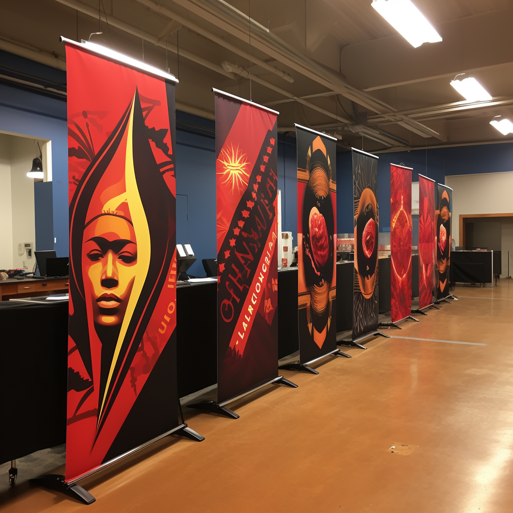
Strategic placement of promo banners is crucial for maximizing brand exposure. The location of your banner can significantly impact the visibility and engagement it receives. High-traffic areas such as entrances, central gathering points, or near stages at events provide optimal exposure, allowing your banner to catch the eyes of passersby. However, it’s not just about high foot traffic; the banner’s height and angle in relation to the audience’s line of sight are also important factors to consider. Elevating banners above the crowd can increase visibility, while ensuring they are angled towards oncoming traffic can improve the chances of capturing attention.
Another aspect to consider is the proximity to related products or services. Placing your banner near items that complement what you offer can create a mental association for attendees, potentially leading to more meaningful engagement. Moreover, understanding the flow of the event and positioning banners along the natural attendee navigation paths can yield excellent results. This method ensures that your message reaches attendees multiple times, reinforcing brand recall.
Lastly, always be mindful of the surrounding environment and any existing signage. Your banner should stand out, not blend in. Choosing colors and designs that contrast with the background will make your promo banner more prominent. Remember, effective banner placement is about more than just being seen; it’s about creating an impact that resonates with the event-goers and leaves a lasting impression of your brand.
Innovative Material and Finishing Options for Promo Banners
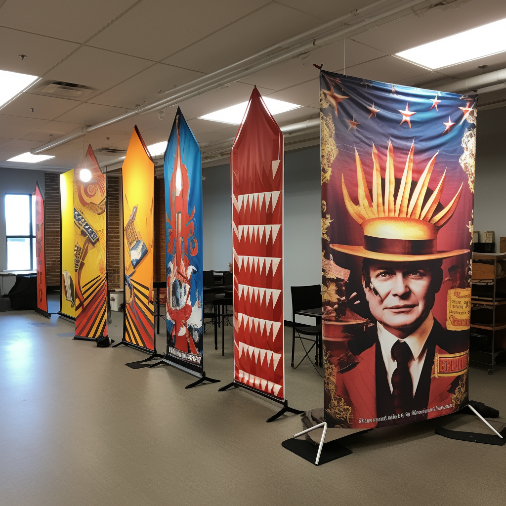
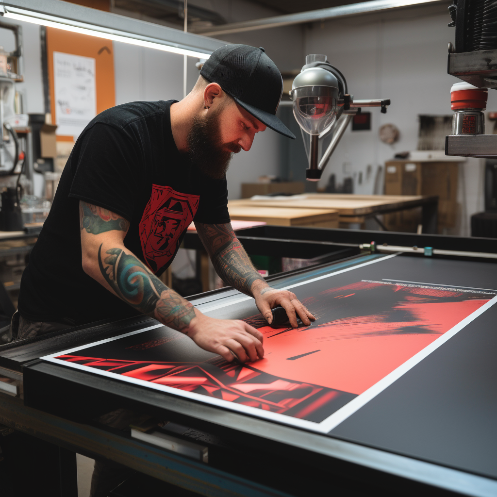
The choice of material and finishing for promo banners can greatly enhance their effectiveness and durability. Innovative materials such as dye-sublimated fabric allow for vibrant, eye-catching graphics that are also resistant to fading and weather conditions. This technique infuses the ink into the fabric itself, ensuring that the banner maintains its impact over time, even with outdoor use.
In addition to material choice, various finishing options can add to the functionality and aesthetic of promo banners. For instance, matte finishes can reduce glare and allow for better readability in bright lighting conditions, while gloss finishes can make colors pop and attract attention from a distance. Other finishing touches, such as reinforced grommets, can extend the life of the banner by preventing tearing when hung or secured.
For businesses looking to make an eco-friendly statement, there are now materials available that are recyclable or made from recycled content. These sustainable options do not compromise on quality and provide a green alternative that reflects well on the brand’s values. Layering different textures and materials can also create a unique tactile experience that encourages people to take a closer look, further engaging them with your promotional message.
Ultimately, the material and finishing chosen for a promo banner can significantly affect both its longevity and the success of the advertising campaign. By selecting high-quality options tailored to the specific needs of the event and target audience, companies can ensure that their promo banners stand out and leave a memorable impression.
Leveraging Color Psychology in Promo Banner Advertising
Understanding the subtle yet powerful influence of color psychology is pivotal when designing promo banners. Color can evoke emotions, convey messages, and influence consumer behavior. Therefore, it’s essential to choose a color palette that aligns with the brand identity and the campaign’s objectives.
Red, for instance, is often associated with excitement, passion, and urgency, making it an excellent choice for sales or events that require immediate action. On the other hand, blue can induce feelings of trust and security, which is why it’s frequently used by financial institutions and healthcare services. Green, often related to health, growth, and tranquility, is apt for eco-friendly or wellness brands.
Moreover, the use of contrasting colors can improve readability and draw attention to key areas of the promo banner. For example, a bright yellow call-to-action button on a deep blue background will stand out and is more likely to prompt a response from the viewer. However, it’s crucial to ensure that the contrast is not overbearing to the point where it becomes a visual strain.
It’s also worth considering cultural associations with colors, as these can vary significantly across different regions and demographics. What might be appealing in one culture could have negative connotations in another. Therefore, researching the target audience’s cultural context is a vital step in the color selection process for a promo banner.
By strategically leveraging color psychology, brands can create compelling promo banners that resonate with their target audience, driving engagement and ultimately contributing to the success of their advertising campaigns.
Case Studies of Successful Promo Banner Campaigns
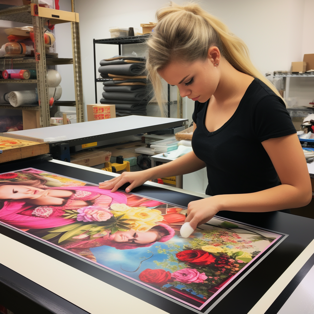
Analyzing successful promo banner campaigns can provide valuable insights into the strategies that resonate with consumers and lead to substantial engagement. Case studies often highlight the importance of a clear message, compelling design, and strategic placement.
One notable example is a campaign by a major sportswear brand that launched a series of banners featuring high-profile athletes alongside motivational slogans. The use of bold, energetic imagery and succinct, impactful text resulted in a significant uptick in online engagement and store visits.
Another case study involves a tech company that capitalized on minimalist design and clean lines to promote its latest gadget. The company’s use of a monochromatic color scheme with a pop of brand color not only reinforced its identity but also created a visually arresting banner that stood out in a crowded digital landscape.
A food and beverage company’s seasonal campaign illustrated the effectiveness of aligning promo banners with current events or seasons. By incorporating seasonal themes and timely product offerings, the brand saw a boost in sales correlating with the campaign’s run.
These case studies exemplify how well-executed promo banners can lead to impressive results. They showcase the necessity of understanding the target audience, the power of a strong brand message, and the art of visual appeal in creating successful promotional materials.
Essential Tips for Creating High-Impact Promo Banners
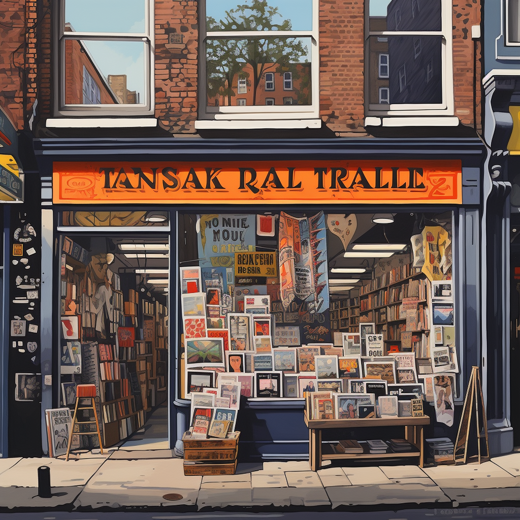
Creating high-impact promo banners requires attention to detail, creativity, and a strategic approach. A visually appealing banner should capture attention, convey a message effectively, and encourage the desired action from the target audience. Here are some essential tips for crafting banners that stand out:
- Understand Your Audience: Tailor the design and message to the preferences and needs of your target demographic.
- Keep It Simple: A clear, concise message with an easy-to-read font is crucial. Avoid cluttering the banner with too much text or too many images.
- Use High-Quality Images: Visuals can make or break your banner’s impact. Ensure all images are high resolution and relevant to your message.
- Brand Consistency: Your banners should be consistent with your brand’s colors, fonts, and overall style to enhance brand recognition.
- Call to Action: Include a strong call-to-action (CTA) that prompts viewers to take the next step, whether it’s to learn more, sign up, or purchase.
These tips are just the starting point for creating effective promo banners that can significantly contribute to your marketing campaign’s success. For personalized assistance and to explore a wide range of promotional signage options tailored to your brand, send a message to info@zodiacdisplays.com. Zodiac Event Displays can help you stand out at your next event with bespoke solutions that capture your brand’s essence and draw the crowd.
